This interior belongs to the architect Ekaterina Lashmanova. Belongs in the most direct sense: she and the hostess, and the author of the project. The basis of the interior formed the impression of a trip to Amsterdam.
 Passing the gallery
 Text: Julia Sakharova
A photo: Sergey Ananiev
Magazine: Decor N1 (178) 2013
This interior is another example of the fact that events lying in an immaterial plane can become the beginning and the foundation of important material things ... The author of the project told our magazine that she had already reworked her apartment more than once, and the last repair started due to the birth of the second child Then friends called in Amsterdam for a week to rest. “It was the beginning of May,” Ekaterina Lashmanova recalls, “and I got to the annual holiday in honor of the queen. On the streets - folk festivals with music and mulled wine, nice people, incredibly beautiful children. The weather changed all the time, and with it the lighting. I noticed that the colors around are bright and cool. I gained impressions: colors, air, light, emotions ... ”
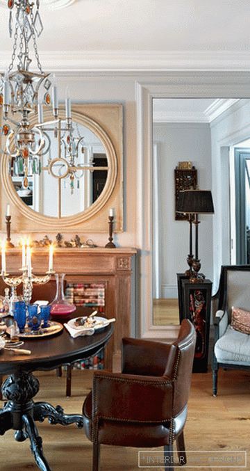
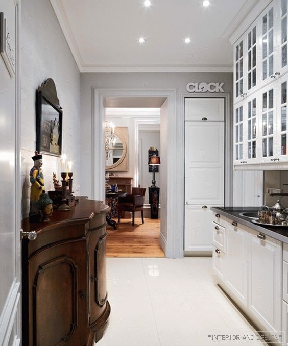
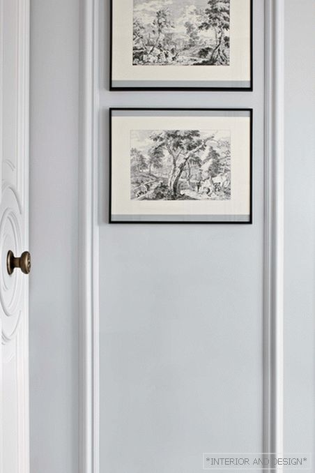
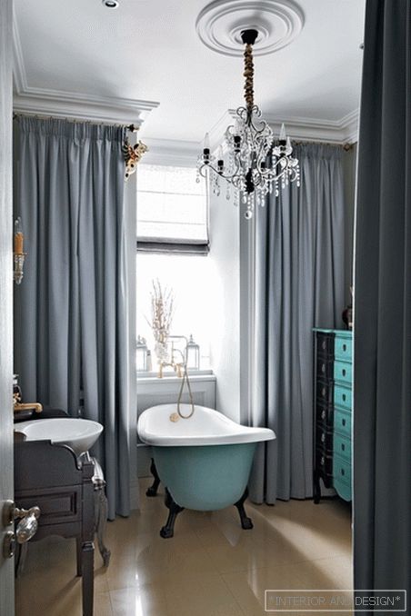
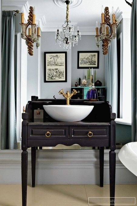
“Dutch” colors - cool gray, gray – blue, light yellow, turquoise - are successfully combined in this interior with neoclassical decor - massive cornices, stucco ceiling rosettes, H-shaped bindings and floor-to-ceiling windows. Windows without tulle - this technique is also inspired by Dutch realities. “In Holland, it’s not customary to curtain windows with curtains, the whole life is in sight,” says the architect. - This tradition is already several hundred years old. I do not suggest her to follow, but personally the laconic elegance of the window without tulle. From thick curtains, I do not refuse. Especially beautiful they look on the "French" windows (in the floor). "
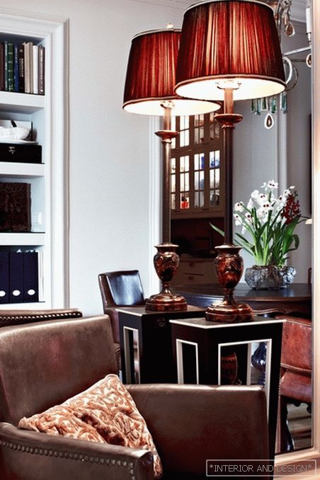
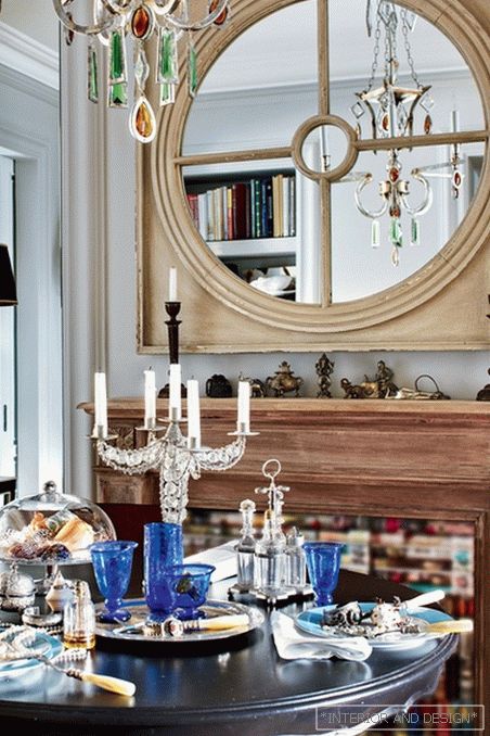
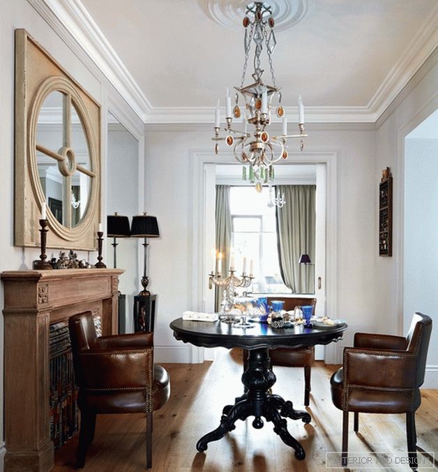
It's nice that in the color scheme there is no any deliberation. Here there are common for European interior shades of natural wood (including aged) and patinated metal. Chairs in the dining room - in the traditional upholstery made of genuine leather brown. Special comfort is created by things that have long been with this family - like an old table, slightly renovated by Catherine for a new interior: it was painted dark purple. Falshkamina and a mirror are only stylized as antique ones, but very well. Left and right of them - mirror panels, creating a convincing illusion of the open space of the living room behind the fireplace.
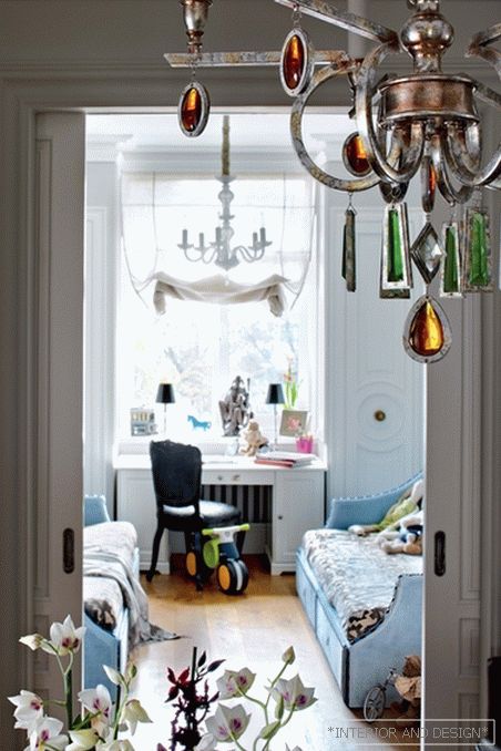
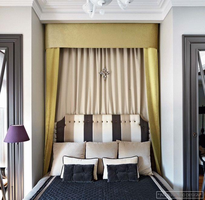
In this apartment there is an interesting layout with elements of a suite: a bedroom, a dining room and a nursery are strung on one axis. (Due to the fact that the nursery is oriented to the north-east, and the bedroom - to the south-west, the apartment is always the sun.) On the other axis - the entrance hall, kitchen and dining room. That is the dining room, where the family often gathers, just in the middle. “The main thing is not the decoration, but the architectural solution of the space,” said Yekaterina. - For me, functional decisions are very important, and for each family they have their own. For us, for example, the dining room is important as a unifying center, in principle the presence of separate rooms. But I cook infrequently, so the kitchen could have a “pass-through” role. ”


