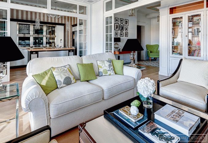
This European-style laconic and bright interior in fusion style was the answer to the request of customers who preferred modern classics and light shades.
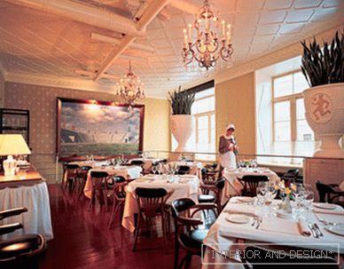
 Passing the gallery
 Magazine: Decor N11 (210) 2015
Project author and decorator Eva Bergman answers questions from the magazine SALON – interior. How did the concept of this interior? “The hosts wanted classics, but without pomp. When the client brought the GRANGE catalog and showed me my favorite color libraries, I realized that everything would be fine, because we understand the classics the same way. In general, the wishes were as follows: a bright interior in a classic style, as large as possible bathrooms, a separate bathroom for children, several dressing rooms, one of which should have been located at the entrance, and a laundry room. The main color in this interior is white, so it was decided to make all the doors, decorative wall panels, and some of the furniture white. This color needs bright accents, so we diluted the white “background” with bright designer pieces of furniture, accessories and textiles. For example, the classic black shelves decided to make the inside bright turquoise. With this decor, they began to look more interesting and modern.
SALON: Tell us about the layout. How are planning decisions related to art? —The apartment is divided into two parts: a nursery and an adult. Her zoning somehow prompted this. All the left wing is given for children's rooms and a children's bathroom. They also decided to locate the laundry facility (due to proximity to the riser). There were as many as four risers in the apartment, and all the zoning proceeded naturally from them. Binding to them was quite tough, as they were in the center of the premises, and had to beat them, taking into account the technical aspects. We also carried out additional zoning inside the premises — we installed, in particular, glass partitions in the apertures separating the kitchen and the corridor from the living room. Thus, more natural light enters the apartment. Initially, we planned to make a glass partition with a hinged door between the corridor and the living room, but later abandoned it in favor of open space and an increase in the area of the living room. From the master bedroom into the bathroom you enter through the dressing room (there are two of them, the second is at the entrance to the apartment, behind the mirrored wall). This is convenient because it creates the right logistics and saves time. The kitchen, living room and dining room originally wanted to combine, so as not to lose space. The zone closer to the riser was placed under the kitchen, and a part with panoramic windows was left for the dining room. And the way the interior looks as a result proves that it was the right decision.
S: How would you define an interior style? —This is fusion. Customers love (besides the classics, what I have already said) fashionable novelties and original solutions, and therefore this style was optimal in this case. It is actually universal, as it allows you to group different objects, different ideas. For example, there appeared a wonderful kitchen with metal elements (MARCHI CUCINE), shelves with bright walls and a metal table – chest. The theme of stainless steel continues in the decoration of chandeliers and table lamps. The hardness of the metal is softened by natural fabrics with bright ornaments. By the way, all materials are natural. The floor is even in the bathroom — made of wood: we put an array of teak in there. The furniture is also made of wood. Wallpaper — paper. We tried to make the interior environmentally friendly. This is especially important because children grow up in this family.
Read the full text in paper or