Designer Boris Dmitriev created a refined interior in a Moscow apartment, as if shimmering with shades of color — from cobalt blue to muted pink.
 Passing the gallery
 Project author: Boris Dmitriev
Magazine: Decor N9 (208) 2015
The author of the project is designer Boris Dmitriev: “We can create a comfortable microworld around us. Being in such a space, you seem to forget about the hard rhythm of modern life. It is good here, it is cozy here. And this interior is just such "
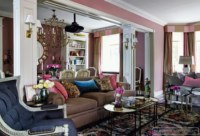
The history of this interior began from the house and from the place — this building of the 1950s, surrounded by a public garden, in the metro area “University”. The owners at the stage of selecting an apartment considered only “houses with history”, because for them, in principle, the relationship of the interior with the exterior of the house and the place where it is located is important. The solution of this space is an interesting example of how this task can be accomplished without directly appealing to the “Stalin Empire” style. The interior is congruent with the environment, but it is softer and more poetic. “The total footage of the apartment is 120 square meters,” the author of the project tells. —The layout was typical for Stalin, dividing the space into rooms where the living room occupied 20 “squares”. We did not destroy the principle of architecture of that time, but made a cardinal decision to combine the living room and dining room into a common room of 44 square meters. Such a volume of ceremonial space is a special quality of life, special sensations. ” This decision in the spirit of a country house was supported by others. For example, a circular movement in the spirit of estate architecture was organized in the apartment (Boris Dmitriev calls this effect “circulation”), the color palette of the apartment as a whole and each room was thought out, and neoclassicism was chosen as the stylistic base. And already on this foundation, a kind of “American history” was implemented — a psychologically comfortable eclectic, including European motifs adapted in the American spirit.
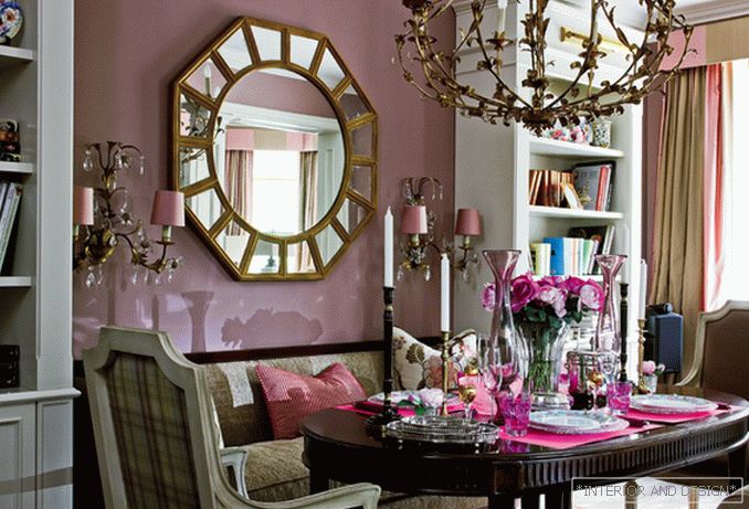
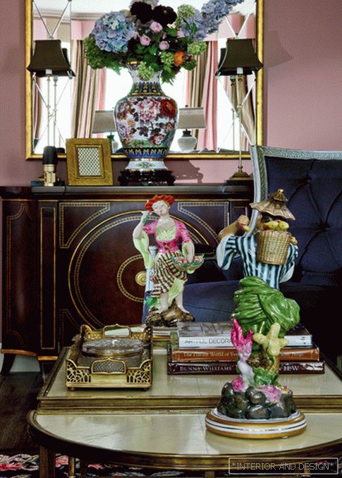
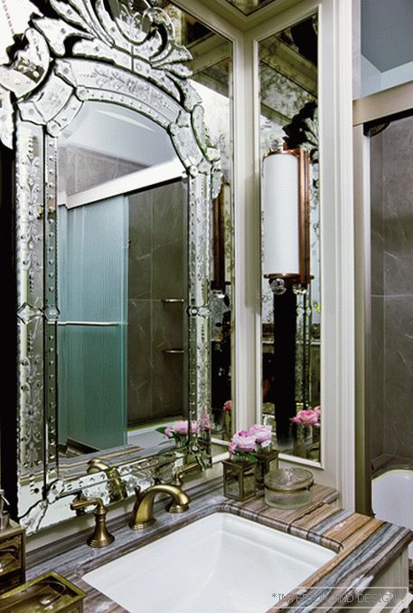
The “French” component is especially noticeable: a gray-pink shade of the walls in the front area, the color of fuchsia in accessories, a lint-free woven carpet imitating cross-stitch, porcelain in the rococo style. "Why? My first profession — clothing design — answers Boris's question. —And the birthplace of fashion is France. And she is always with me. Therefore, some decisions in the French spirit are naturally born in the process of work. ” The profession of a fashion designer predetermined a very special relationship with textiles: upholstered furniture was covered with high-quality fabrics of “high” brands, taking into account the general concept of the interior, meticulously working on the compatibility of curtains, carpets and upholstery. ” The result is harmony of textures and shades, comfort without a feeling of “wrapping”.
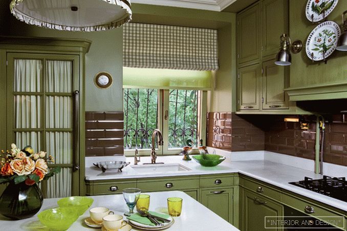
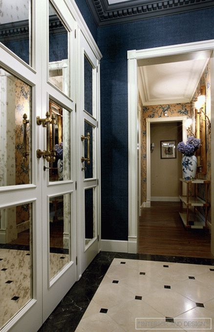
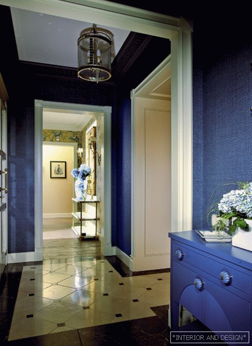
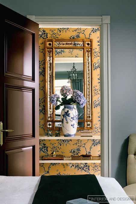
“The hostess has taste, there is a sense of color,” the designer notes. “And it is very important for me that she supported bold color solutions. Here the color story unfolds gradually, without abrupt transitions; we have established the relationship between shades of color in different rooms. " From the blue hallway you find yourself in a beige with blue flowers hall. From here straight, another hall, beige. From it to the right is the front area of the dining room and living room (pink), to the left, the kitchen (olive). It seems that the blue color is completely dissolved, but it is still present in the ceremonial area — in decorative pillows. The olive kitchen echoes in color with the son's bedroom (the entrance to it is from the blue hall). From the blue hall there is an entrance to the pink living room, and, passing it and the dining room, you can go to the beige hall, then to the beige with blue flowers (hence the entrance to the master bedroom) and finally return to the blue hall. This is a cleverly organized circular movement, coupled with the overflow of color, somewhat confusing: the apartment seems much more than it actually is. “When you move freely, you get a feeling of large volume,” confirms the author of the project.
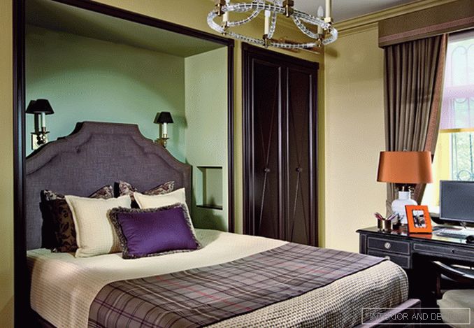
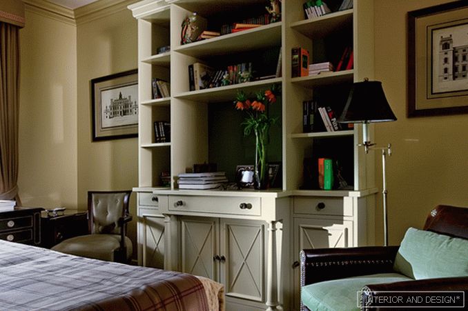
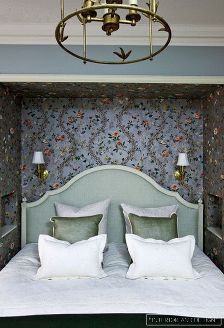
Storage spaces simply “dissolved” in the interior, creating a unique “relief” of space with niches and alcoves. For alcoves used and ceiling beams. “In the bedroom, one alcove appeared as a result of the embedding of two cabinets, and the other, on the contrary, just because of the beam, Boris recalls. we lowered the wall along it and made a niche for the dressing table. ” Before us is another paradox of this apartment: receptions that, it would seem, should work to “reduce” the space, make it feel more. And besides, richer and more interesting.


