This elegant apartment has a clear two-part layout, and the author defines her style as “modern classic”.
 Passing the gallery
 A photo: Dmitry Livshits
Text: Julia Sakharova
Stylist: Yevhen Shuer
Magazine: Decor N3 (180) 2013
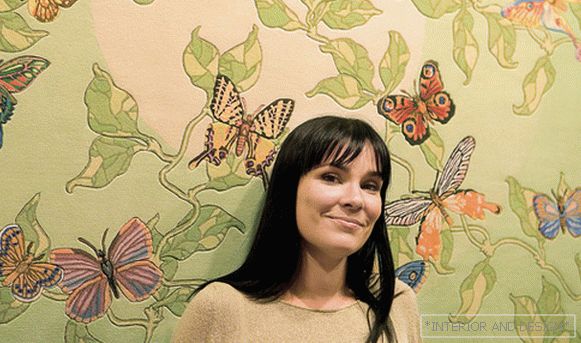
The author of the project, designer Natalia Friedland, says that this interior began with purely functional tasks, and only then, as their continuation, a decorative solution appeared. “My client immediately indicated that she would live in this apartment with her husband and with a 10-year-old son,” says Natalia Fridland. “And from time to time they will be visiting their daughter, a student, who has her own apartment.” This apartment is a linear layout, with windows on one side. Therefore, the best that could be invented here is a two-part division into private and ceremonial zones. In the private part we designed two bedrooms - a nursery and a parent. In turn, in the nursery they organized two berths. To the right of the entrance hall is the entrance to the main territory - the open space of the living-dining room and kitchen. (If necessary, the living room plays the role of a guest room.) The logic of the layout required the presence of two bathrooms - a bathroom in the private area and a guest bathroom - in the public. Part of the living room area was used as a dressing room (one of its walls is also the living room wall).
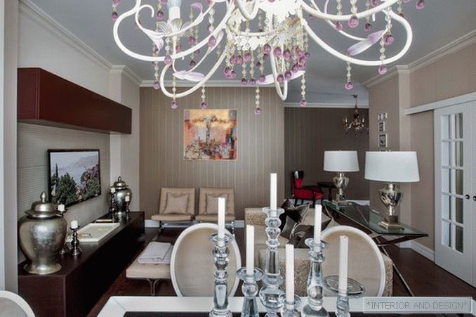
To visually bind together the entrance area, dressing room and living room, the author of the project decorated this wall in the living room with striped wallpaper. “The interior color solution is almost monochrome,” says the designer. “As the main color, we used a cool beige tone, shading it with white and dark brown.” So that the monochrome interior does not look ascetic, Natalia Fridland saturated it with various textures. These are painted surfaces, wallpapers, relief coatings, which refract light in different ways. A special theme is the textures of natural wood, leather, silk and white metal accessories. Laconic color and form, natural materials, individual solutions - all this fits into the concept of modern luxury, so characteristic of the author's style of Natalia Friedland.
If you wish, you can see the influence of ar-deco here, but in general it is a rather mediated modern style that uses the workings of previous eras very carefully and inadvertently. His main task is not to show himself, but to be comfortable. Although there are iconic things here, for example, Mies van der Rohe’s design chairs or huge metal twin vases (ANDREW MARTIN). There is also a fashionable modern painting - the work of the Italian artist Boarini. Besides the fact that it is good in itself, it plays the role of a juicy color spot. According to the theory of Natalia Friedland, color accents are generally necessary in such an interior. And here, in addition to painting, in this role are the individual objects of a thick garnet color — the armchair, the details of the chandelier, and the pendants of a desk lamp.


