three-level apartment with a total area of 350 m2 Andrei Shmonkin, Olga Gorovaya
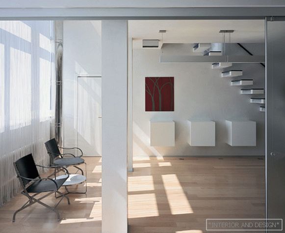 Passing the gallery
 A photo: Kirill Ovchinnikov
Interview prepared: Danila Gulyaev
Stylist: Marina Shvechkova
Project author: Andrey Shmonkin, Olga Gorovaya
Painting, graphics: Stefan Spycher, Alexey Gorev
Individual interior elements: Denis Stritovich
Magazine: N11 (100) 2005
Рассказывает архитектор Andrey Shmonkin: "Ситуация при работе над этим проектом сложилась уникальная: у владельцев квартиры определенных пожеланий по дизайну и планировке не было. Когда мы пытались выяснить какие-то нюансы их образа жизни, чтобы сделать интерьер соответствующим, заказчики сказали - как сделаете, так и будем жить".
SALON: The interior was very concise. You, apparently, did not abuse the freedom provided?
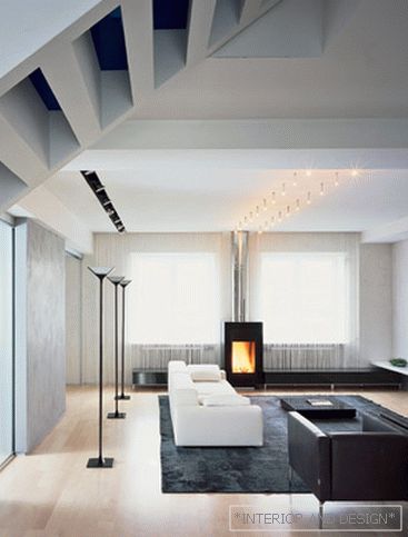
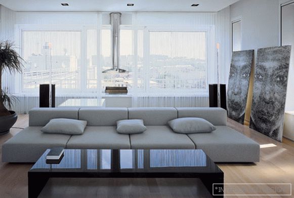
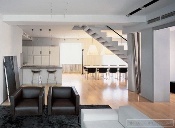
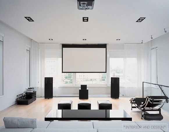
- And I do not like abuse. You know, when you find yourself in an apartment that has not yet been formalized, in a merely empty room with large windows, in which there is a lot of light and air, you do not want to violate the freedom of this space, to spoil it with design. When working on a project, it is often necessary to make partitions, to install a lot of things, to clutter up, and there is no such space left as at the beginning. Therefore, I decided to save and beat the main thing in this space - air and light.
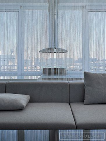
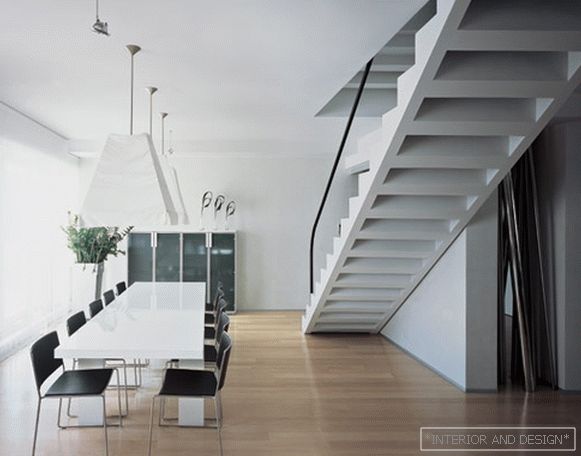
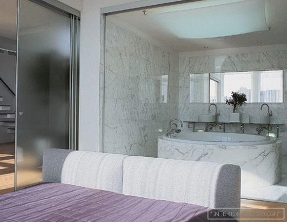
Accordingly, it is daylight - the most designer object in the apartment. And, of course, special emphasis is placed on the windows - they are in the foreground, one might say dominate. Apartment zoning is free, as partitions - glass sliding doors, which can be opened completely, and there are no like them. Only on the first floor a separate gray cube is made - this is a guest bathroom. It is cut off from the floor and from the ceiling, as if hanging in the air like a foreign object. It is installed in order to emphasize the integrity of the whole space. We specially selected sofas with low backs so that they did not look like partitions. In general, we refused furniture with a bright design that would distract attention, we wanted it to be simply functional.
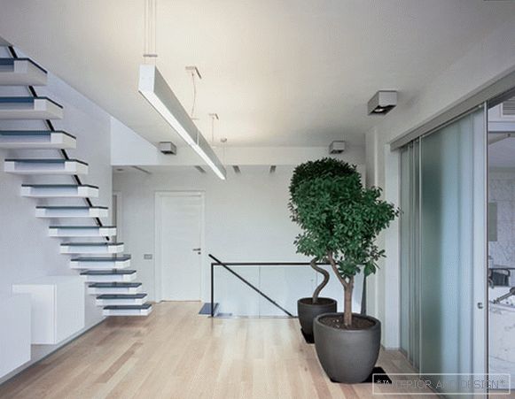
S: Outstanding stairs in this apartment immediately draw attention to themselves. Apparently, this is more than just a ladder ...
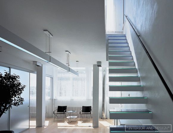
- Ladders perform the function of stained glass. They are designed to refract and reflect light. Both in daylight and in electric they shine and twinkle. In addition, through the space between the steps, the light falls on the floor and walls with beautiful graphical stripes. In order not to hinder the play of light and shade on which the entire interior is built, all the walls and ceilings are finished in the same way - they are nice-cool white or, more precisely, almost gray. It all looks most beautiful in the sunlight — it plays on all planes in a special way, and even in cloudy weather, interesting effects occur, and even in the evening, with electricity.

