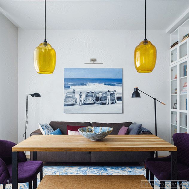
 Above the sofa is the work of Alexey Alpatov. The table “House of Worship (Russia), Pranzo chairs, Ikea bookcases, a vase on the table are the work of Elena Skvortsova, floor lamps by the sofa: Marset and Julia Grup. lamps over the table Madam Stoltz.
 Two bedroom apartment of 70 square meters. m is located in a building built in 1929. Customers - connoisseurs of constructivism, were looking for an apartment in such a house in the Krasnaya Presnya district. They wanted to get a concise, bright, but not fresh interior. Tells the author, designer Irina Krasheninnikova.
Related: Irina Krasheninnikova: Modernism of the 70s
“Customers are a family of three: thirty-year-old parents and a three-year-old baby. Dad practiced rugby for many years, now he is keen on squash. Mom is busy promoting children's reading, participates in a book club. Positive, hospitable, friendly people.
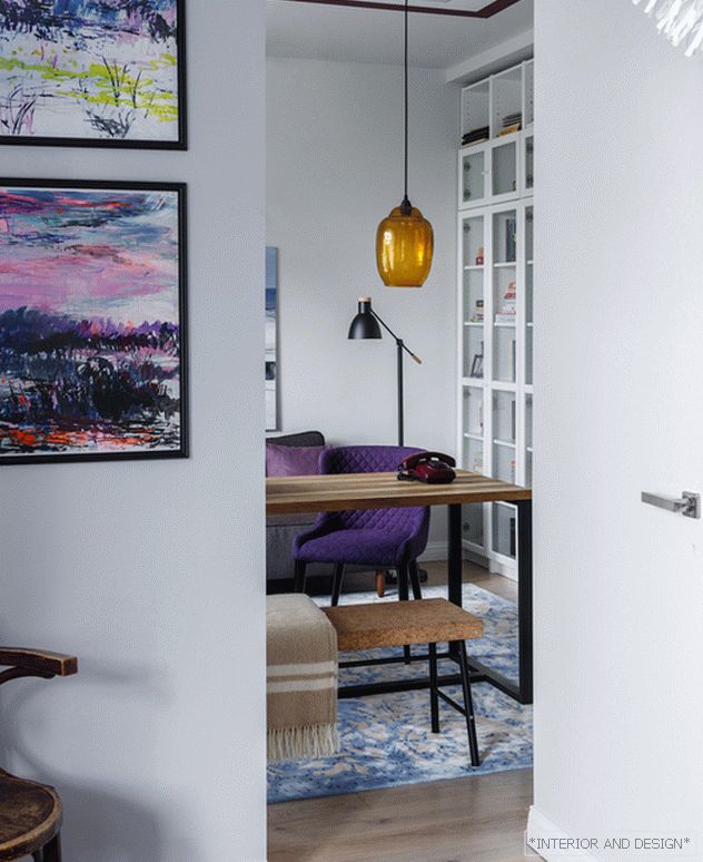 View from the bedroom to the living room. On the wall graphics Vitaly Barabanov.
 The hostess loves to cook, so the kitchen required a spacious, separate from the reception area. Customers asked to pay special attention to the bathroom, they specifically searched for an apartment with a window in the bathroom. Since the family has a large library, it took a lot of space to store books and with a good margin for their growth.
 The bedroom adjoins the living room. The Valilla panel is placed above the bed so that it forms a composition with the works of Maria Semenskaya. On the table is the vase of the ceramist Elena Skvortsova.
 The advantage of this apartment were windows on two sides and the presence of a French balcony in the bathroom. The disadvantage is the lack of storage space and “air”: despite the large windows, the apartment gave the impression of being low and stuffy. I wanted to develop a project that meets the lifestyle of this family - just as open. During the redevelopment did not change the boundaries of the bathroom and kitchen, but designed wardrobe rooms and connected the kitchen and living room with a spacious hall.
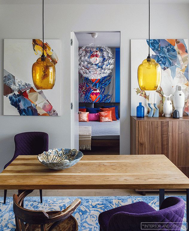
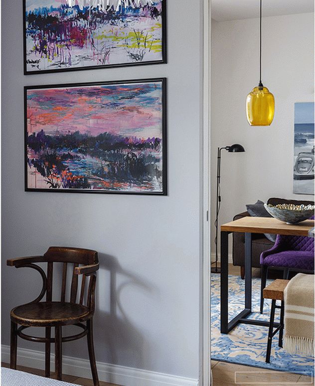
 The door leading from the living room to the bedroom is almost invisible. On the right and left of her work by Maria Semenskaya. Table “House of Cult (Russia), Pranzo chairs, wooden chair: Soviet vintage. The vase on the table is the work of Elena Skvortsova, the lamps above the table Madam Stoltz.
 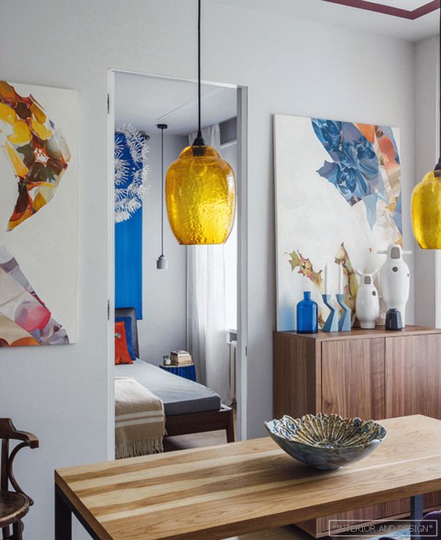 Table "House of Cult (Russia), soft chair Pranzo, wooden chair - Soviet vintage. The vase on the table is the work of ceramist Elena Skvortsova.
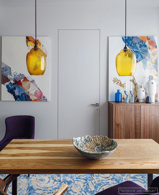
 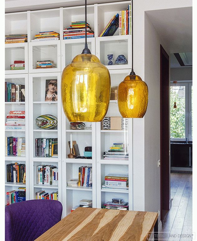 The table “House of Worship (Russia), Pranzo chairs, Ikea bookcases, a vase on the table is the work of Elena Skvortsova. Lamps over the table Madam Stoltz.
 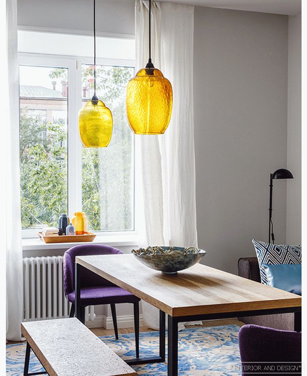 Cork bench: Sinnerlig limited edition series by designer Ilze Crawford, Ikea. Sculpture of Olga Muravina "Boy in the sun." The table “House of worship (Russia), Pranzo chairs, a vase on the table is the work of Elena Skvortsova. Lamps over the table Madam Stoltz.
 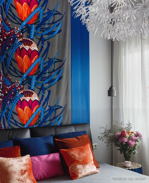 Bedroom. Bed and hanging lamp Ikea. Bedside table Bizzotto, hangers by the bed Zuiver. Panel at the head of the bed Valilla.
 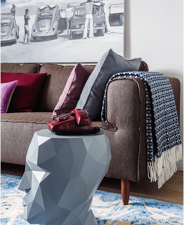 Living room. Sofa BoConcept. Side table Vondom. On the wall is the work of Alexey Alpatov.
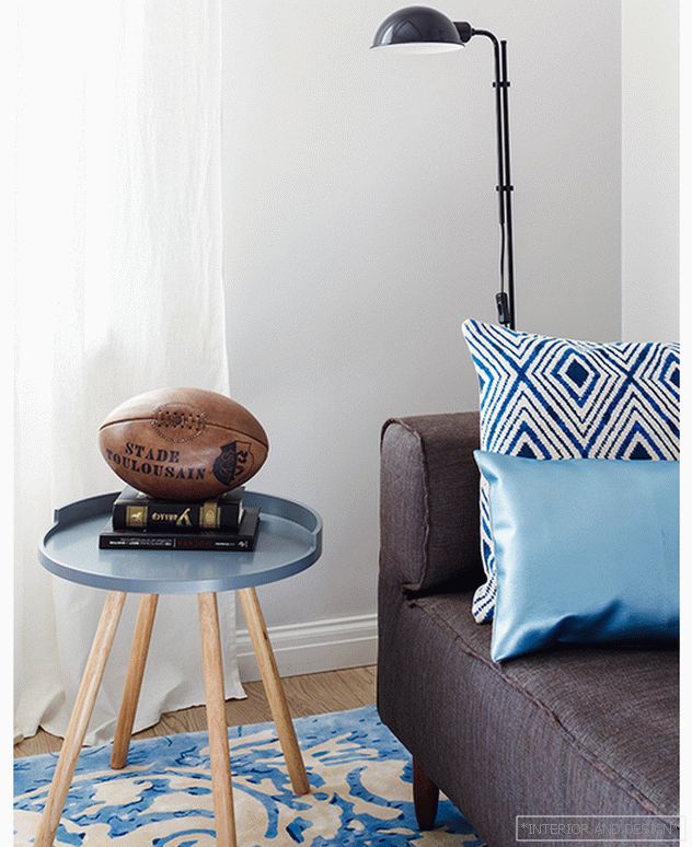
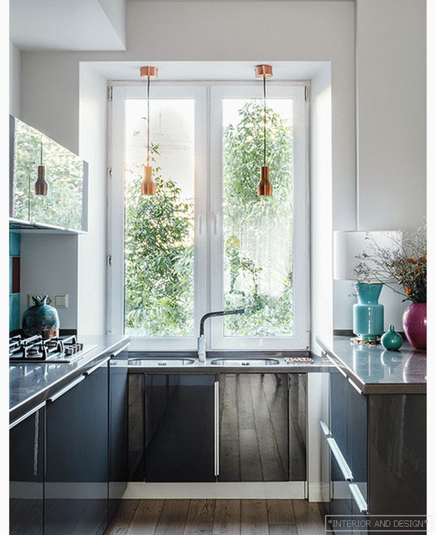 Kitchen set made to order, lamps by the window Zuiver. table lamp Aromas del Campo.
 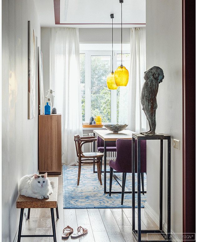 Cork Bench: Sinnerlig limited edition series by designer Ilze Crawford, Ikea. Sculpture of Olga Muravina "Boy in the sun."
 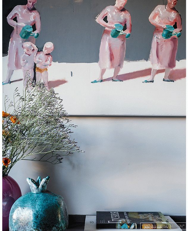 Kitchen. Painting by Natalia Zalozna. Turquoise pomegranate is the work of Turkish ceramist Tevfik Tyuren Karagozoglu.
 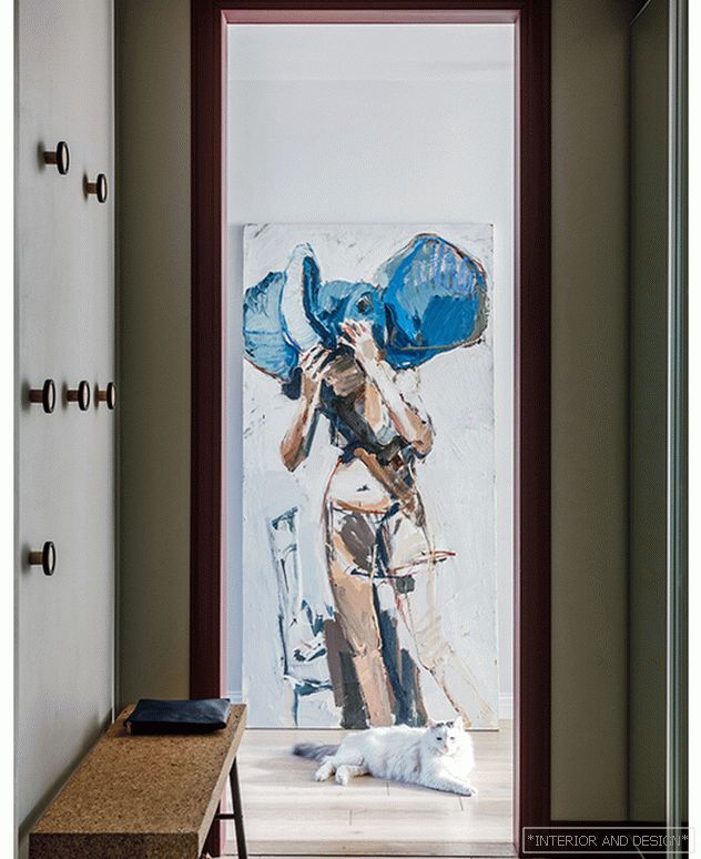 The entrance hall. Cork bench: Sinnerlig limited edition series by designer Ilze Crawford, Ikea. Painting by Vladimir Semensky. Wall hanger Umbra. Built-in wardrobe is made to order.
 The style in which it is made, I call the "Russian-Scandinavian." I love the Scandinavian style for its restraint, environmental friendliness, optimism, convenience. It is relevant because it is a large-scale modern lifestyle and architecture in which the majority of the population of our country lives. But "my" Scandinavian style is always very Russian. I never create completely white or dark gray interiors, as they do in Sweden or Denmark. It looks great in them, but we have a different mentality and a different color of air in Russia. This project is an example of the adaptation of the Scandinavian style for the Russian conditions.
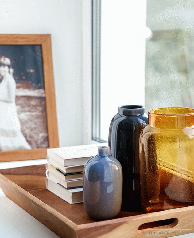
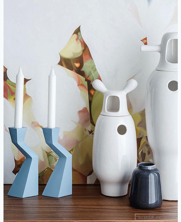 Вазы на комоде: BD Barcelona Design, H&MHome, Julia Grup.
 Color The interior is complex, emotional. Neutral colors of large surfaces (walls, floor, ceiling) are complemented with accents of rich natural colors: plum, turquoise, grass green, honey yellow, cobalt blue, purple, tangerine - everything in this set forms a rich mix of colors and emotions.
I rarely use such a number of additional and accent colors in the interior. However, the key to the success of this project were works of art that became not only bright accents, but also the basis for the development of its palette. The basis of the collection of paintings consisted of works by artists of two Moscow galleries: 11.12 and Osnova.
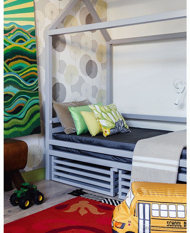 Детская. Кровать Doodywoodydom. Светильник &tradition, стул Panton Junior Vitra. Ковер GAN, пуф Woouf!. Картина Дамира Муратова.
 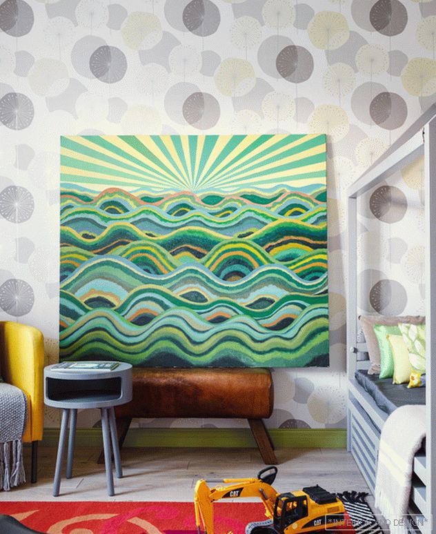 Детская. Картина Дамира Муратова. Кровать Doodywoodydom(Россия), светильник &tradition. Стул Panton Junior, Vitra, ковер GAN, пуф Woouf!.
Я использовала предметы скандинавских марок (Louis Poulsen, &tradition, BoConcept) в сочетании с испанскими, а также вещи российских дизайнерских брендов (Archpole, «Дом культа», Doodywoodydom). Дорогие соседствуют с демократичными. Заказчики – люди интеллектуального европейского склада, их больше интересовали смыслы, а не бренды. Так, хозяйка квартиры очень хотела видеть в своем интерьере светильник Artichoke Поула Хеннингсена. Чтобы уложиться в заявленный бюджет, мы решили использовать недорогие систему хранения для книг и кухню, но выделить средства на Artichoke.
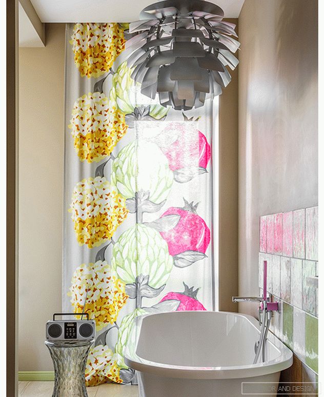 Bathroom. Plumbing ArtCeram. Mixers Tres. Vispool bath. Louis Poulsen lamp, Kartell stool, Transistor - Soviet vintage. Textiles Valilla. Tile Iris Ceramica.
 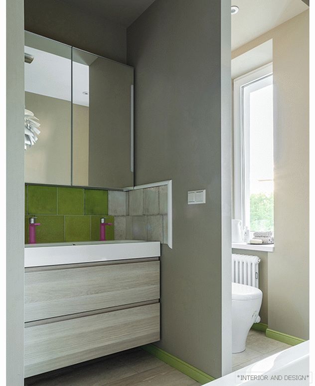 Bathroom. Plumbing ArtCeram, mixers Tres. Lamp Louis Poulsen. Tile Iris Ceramica.
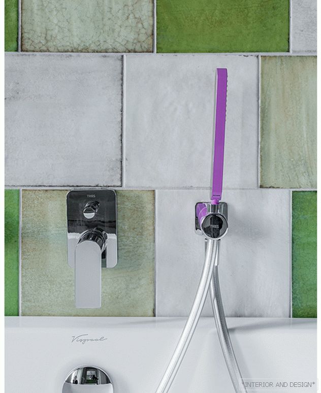
Under the Artichoke lamp, I found textiles from the Finnish factory Valilla in a pop art style called “Artichokes and pomegranates”. From it we sewed curtains for the bathroom. And then she brought from Bodrum a sculpture “Pomegranate” by Turkish ceramics artist Tevfik Tyuren Karagozoglu, which perfectly matches the color of the selected ceramic tile. It turned out that it was not by chance that pomegranate was the favorite fruit of the owner of this interior. I called the project “Pomegranate Color”. True, in our case it is turquoise. ”
 The author of the project is Irina Krasheninnikov.
