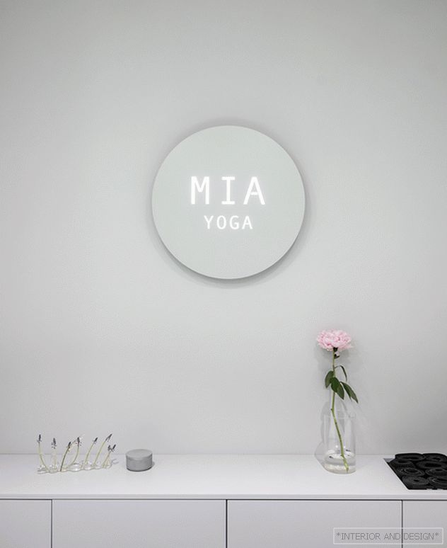
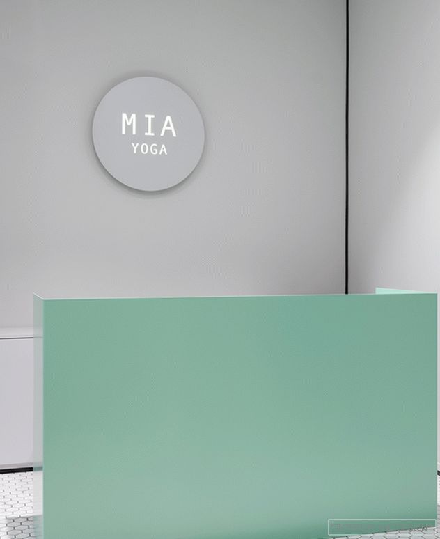
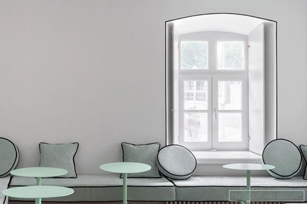
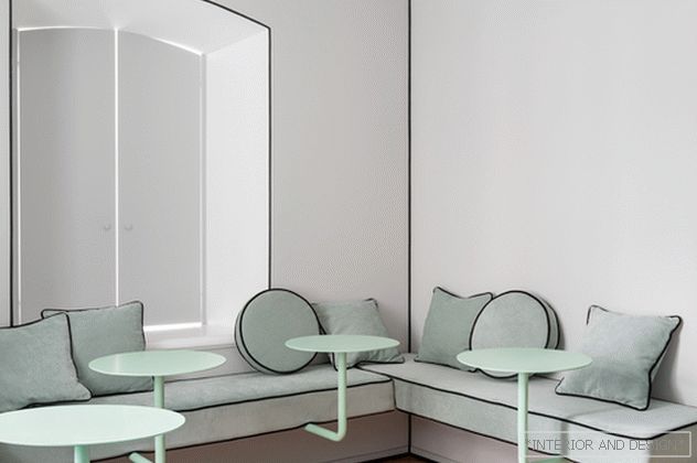
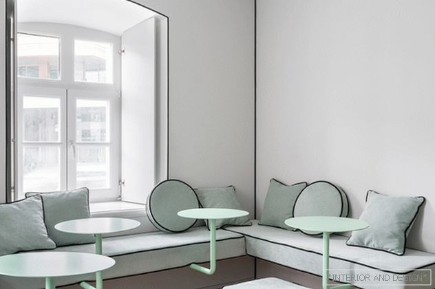
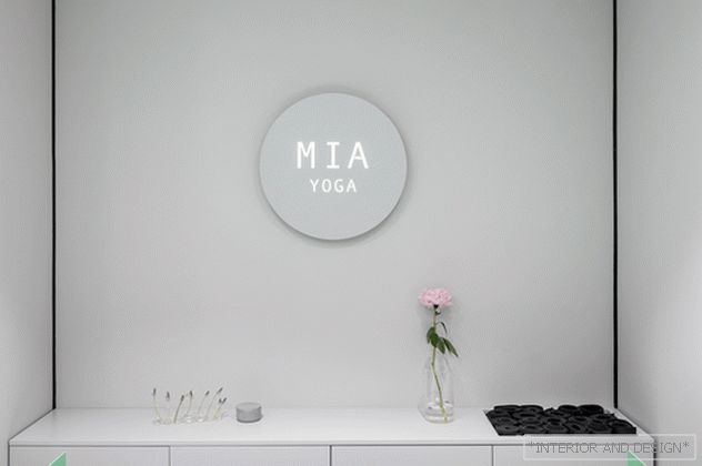
Yoga studio MIA Yoga at Volkhonka in Moscow - Crosby Studios project for Ekaterina Kushner. Says the author of the project, Harry Nureyev:
Related: Garry Nuriev: “New York Chose Me”
“This is an interesting story. For almost ten years I went to another Katy studio and every time I dreamed of redoing the interior, but I was embarrassed to offer it. And now the Studio came to me by itself - for a new space. I have been practicing yoga for a long time and have been to many studios around the world. They all looked different, but in fact were similar. I always wondered: how would I do a yoga studio?
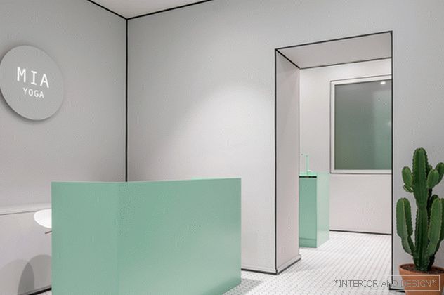
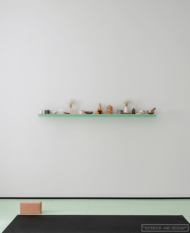
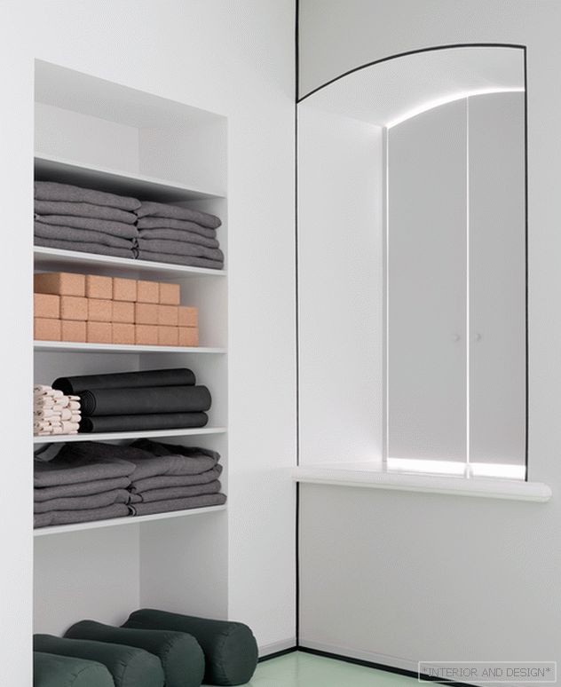
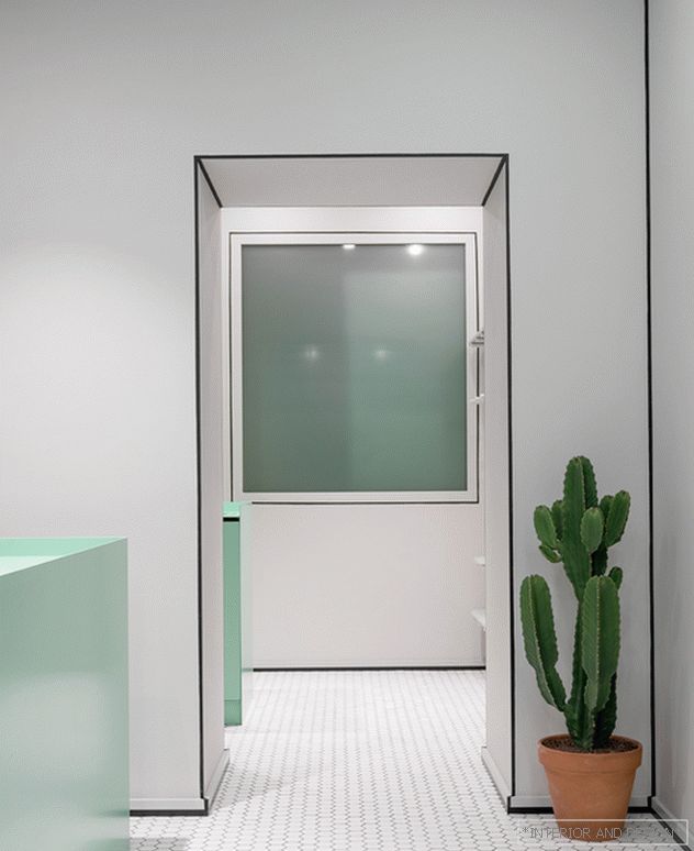
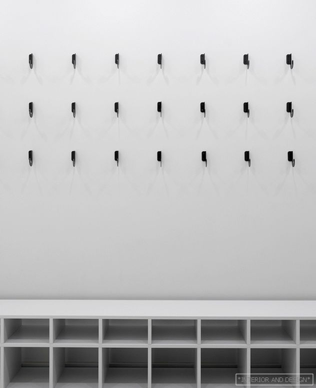
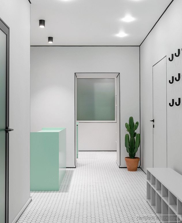
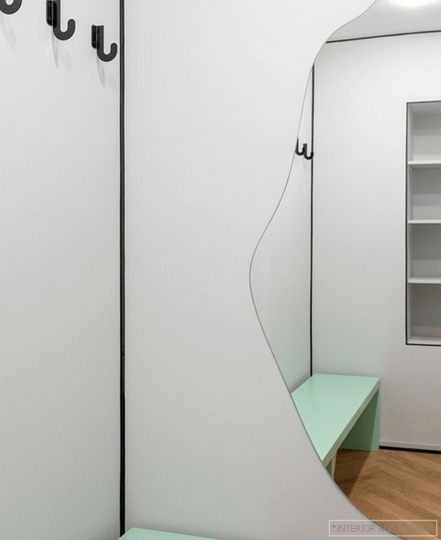
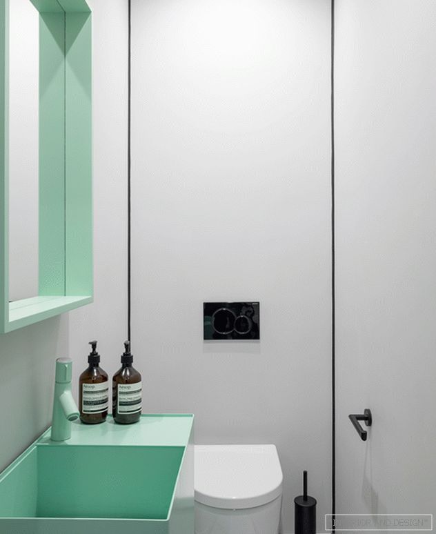
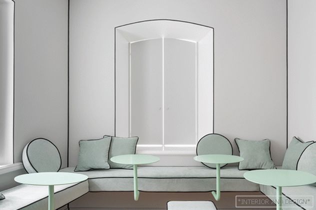
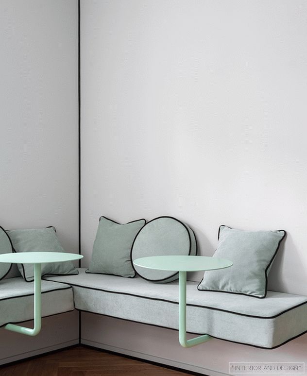
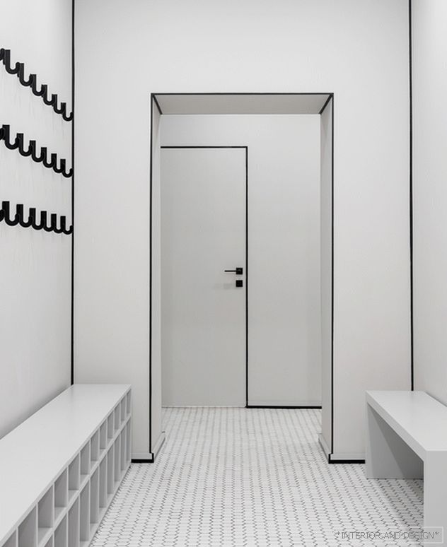
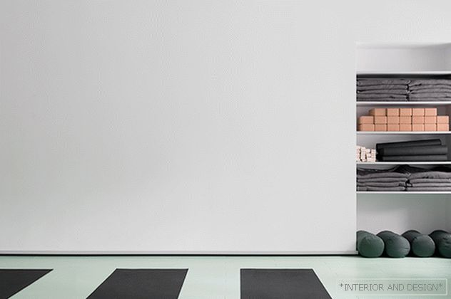
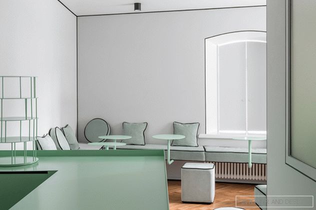
All my projects are not similar to anything and visually contrast with the purpose of the space. I repeat, only visually. For example, my beauty salon looks like a cafe, a cafe at a showroom, etc. Here I also have not changed myself. Inspiration came from the aesthetics of Shaker House - the traditional home of the shakers. Strict lines, like asanas, pure colors like pure consciousness. Nothing distracts from the practice. Except maybe delicious cupcakes in the cafe, which is part of the studio.
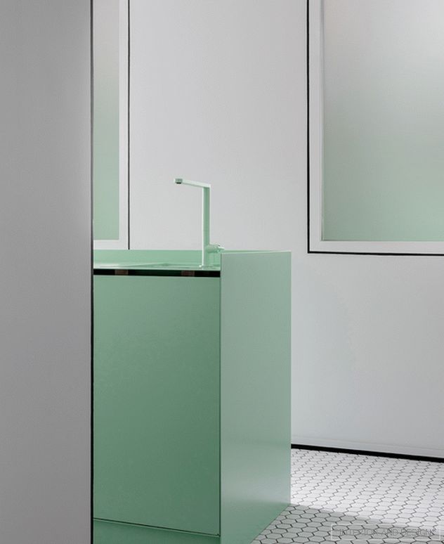
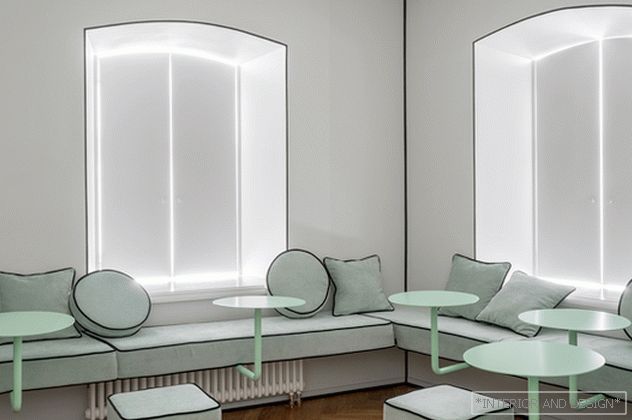
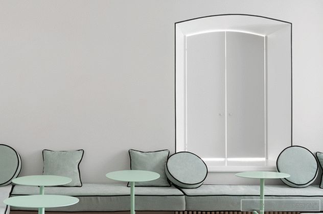
About color. Green shade for the studio chosen by the customer. I wanted yellow. But I also love this green, so I agreed. I have already used this green color several times, and for a new studio I wanted a completely new one. By the way, interest in this color came to me after I saw him on the facade of the Mariinsky Theater.
About restrictions. They are the same everywhere: timeline and budget. But without them, work is also not interesting. Everyone can make beauty, if money is a sea and time without a limit, but there is a feeling of victory when you work with certain barriers, overcoming them. The main thing in our work is to know all the barriers in advance.
About the design code I have my own design code, and color plays an important role in it. He is responsible for the emotional component of objects and spaces. The shape plays a big role in this too, but the color effect intensifies. My recent hobby is purple, for me it is an egoistic color, a color-challenge. Partially it remains in some projects. The next one will be yellow, but in new projects I increasingly combine several colors. New professional experiment - a combination of incompatible or poorly compatible colors. This inspiration came to me from the urban crowd, not even street fashion, but the chaotic combination of clothes not familiar to each other people who form the palette of the street.
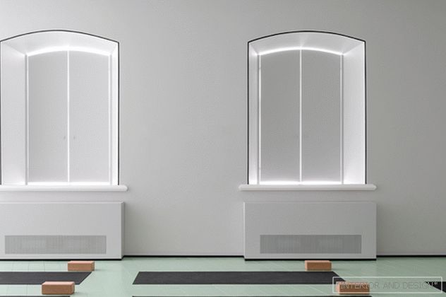
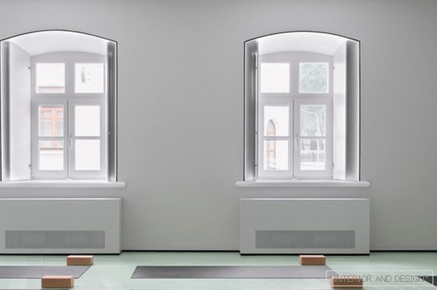
About trends. When in 2014 I made a project with arches and pink floor, everyone looked at me strangely, including a client who discouraged using these, as she put it, “aqueducts”. Now pink is the color of the millennium, and the arches are used from industrial designers to Acne Studios in their new store in Milan. So trends for me are old news. I'm interested in learning new things and experimenting.
Pro instagram. Instagram is a new television. You can relate to it as you please, but for example, Angelina Jolie can afford to ignore such a convenient promotion tool. For me, this is a way to communicate with the world every day, without leaving the studio. My inspiration to create collectible furniture came when I saw the instagram of my future gallery owner Patrick Perrish. I met him through the direct in the same instagramme.
About popularity. For the designer always speaks only his innovation. Of course, the quality of the product, the production, the level of the brand with which you work, the number of references to you by people whose opinion is important plays a huge role. But in the end, the most important thing is the innovation and the wit of the project. Extraordinary always pave the way to success. "