A bold and at the same time ideally balanced eclecticism is the secret of this elegant Moscow interior.
 Passing the gallery
 Project author: Maria Polykarpova
Magazine: Decor N6 (216) 2016
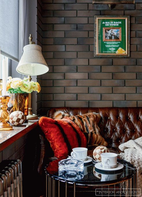
Entering the apartment, you immediately pay attention to the large, to the floor, windows of the living room-dining room, to the huge picture — the seascape, written in an abstract manner with large strokes. "Splash" on the plane of the wall. And you understand that the whole apartment is also written in “large strokes” —a massive caisson walnut ceiling, door planes, recessed into wall panels (and therefore perceived as one with them), a large imposing sofa, large laconic lamps. Then a look pulls out and a brick kitchen apron. It is not fully open to the living-dining area, but partly hidden behind a partition. And this is an intrigue: I want to go on, to see, and what is there? Entering the kitchen, along the way, you uncover the secret of the glass cube curtained with blinds: here, it turns out, they made a cozy room, the “privacy room”, as its owner called her. The drapery opening hides the corridor to the private zone, where all the techniques given by the front part of the apartment will open up in a new way: laconicism, work on contrasts, bright decorative accents, “plot” of the general idea that you unwittingly read while moving around the apartment. “The interior begins at the planning stage,” says the author of the project, Maria Polikarpova. It is at this stage that the professional creates views. What does a person see when entering an apartment? What will he see when he takes the next step? How is the apartment "revealed"? All this is laid in advance and immediately. ”
The designer says that she didn’t become “shallow” by cutting many small rooms — fortunately, the size of the apartment (140 square meters) allowed it. (They also did not save on the nursery: it is a full-fledged, large room.) The result was a space with an amazing atmosphere, in which there is a sense of respectability, freedom, inspiration and artistic chic. Behind the high windows is Moscow, not New York, and yet in the artistic solution of this interior there is a certain American touch. “That's right,” confirms the author of the project. “To start work on this apartment, I have just returned from America. There I understood and felt very well the American urban style. And when the customers told me that they would like their house to be in the style of modern classics, and very modern, light, I invited them to bring some notes of this style into the interior. ”
With "New York" windows, a separate story. They not only became a style-forming detail, but also played a role in the choice of a palette. And even the choice of ultramarine – blue hue in the master bedroom is associated with them. In what way? Maria Polikarpova says that whenever she comes to an object and sees it in concrete, she pays attention to the windows. Here, for example, the windows are very large — it means there will be a lot of daylight in this interior. And that means you need to use natural tones — in such conditions they will work beautifully. For example, ultramarine. Here it is very much in the bedroom, it is in the seascape in the living room. “This color has refreshed and modernized the classics,” the designer sums up. The classic here is generally presented very carefully - in analogies, hints. For example, a widely used walnut tree is a traditional material for a classic interior. But it is presented in a modern way — without panels, without thread — minimalistically smooth surfaces. The ceiling with caissons is a reception from the arsenal of the classics, but even it is modern and reminds more of the Art Deco era, and the design of the rustic table and chairs only guesses the style of Louis XVI.
Read the full text in paper or


