apartment with a total area of 150 m2 at the junction of two houses (St. Petersburg)




 Passing the gallery
 Text: Nikolay Fedyanin
A photo: Yury Molodkovets
Stylist: Vladimir Nikiforov
Project author: Vyacheslav Chomutov
Architect: Margarita Magylatova
Designer: Konstantin Nikulin
Magazine: (107)
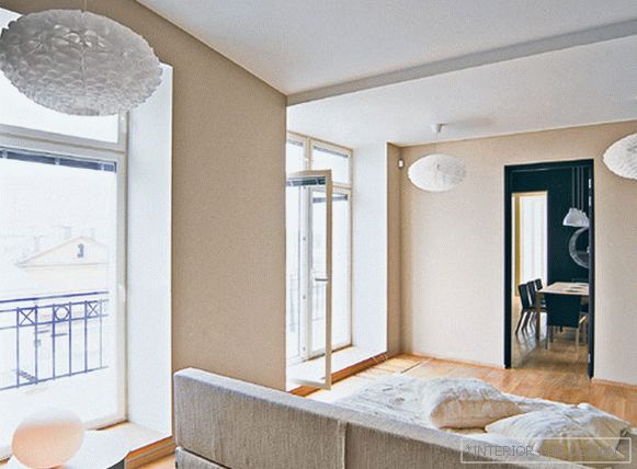
The house where this apartment is located is located in the very center of the city, on Millionnaya Street. "The windows offer a great view. When you look out of the bedroom windows, on the one hand you can see the Neva and the Peter and Paul Fortress, and on the other, a series of roofs, like in Rome. Since the view itself is very beautiful, we decided not to do any accents ", - tells
In fact, when you find yourself in a room, you involuntarily wonder precisely at the lack of accents. In St. Petersburg Khomutov is known for its projects of cafes and restaurants. AT X’ren restaurant, he made four rooms in different colors and decorated the glass panels with several times enlarged drawings from ancient manuscripts. And in Cafe "Mama Roma" pasted over the ceiling with white wallpaper with a pattern of red corals and hung a large chandelier that resembles a giant white coral. There are no such flashy details in this apartment. The work of the architect was to open up the space, let in the sunlight and allow the owner to enjoy the view outside the windows.
The apartment itself is located at the junction of two houses. Living room and dining room belong to the same house, and the bedroom and bathroom - to another. When the architects from the studio
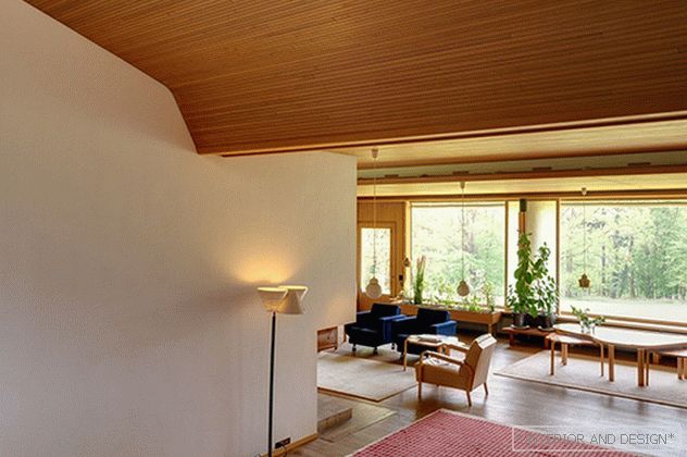
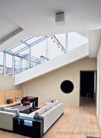
The living room was the brightest room in the house. Sunlight comes here from both sides at once - through the windows cut through the firewall and through the glazed opening in the roof. The glass "cap" is raised above the roof surface so that the living room space seems even more spacious.
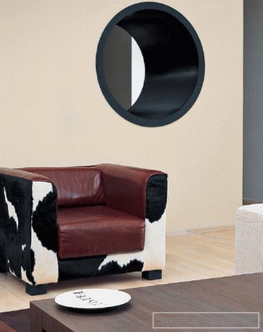
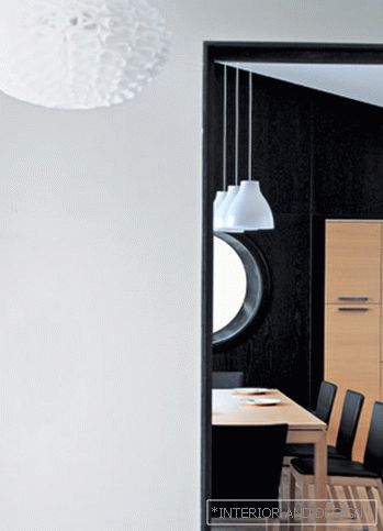
At the junction of the living room and dining room, the architect allowed himself a small variation on a given topic. A round window appeared in the main wall between the living room and the dining room. And the architect has decorated the wall itself from the dining room with panels of dark wenge wood. This detail has become a real counterpoint in the interior. “The wall in the dining room is the only dark“ piece ”in the house. Due to the fact that it is dark, everything else seems brighter,” the architect explains his idea.

