apartment with a total area of 210 m2 in Moscow Anna Karpova, Dmitry Kulish
 Passing the gallery
 A photo: Zinon Rasudinov
Interview prepared: Olga Korotkova
Project author: Dmitry Kulish, Anna Karpova
Architect: Надежда Заздравных
Magazine: N1 (101) 2006
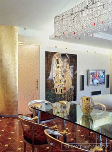
The apartment is formed by merging two of the same. The plan is a square. And the style of the interior would be correctly defined as "neklassika."
Dmitry Kulish: "We went from furniture ideology
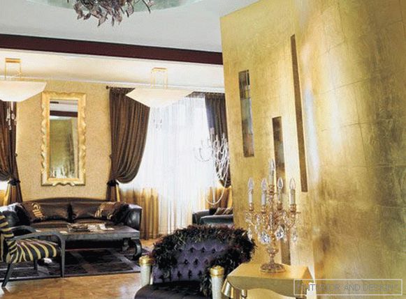
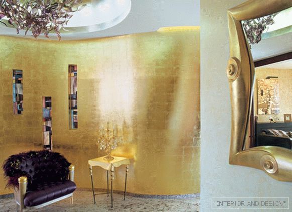
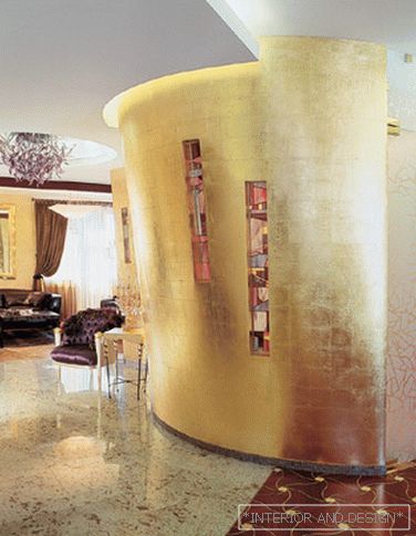
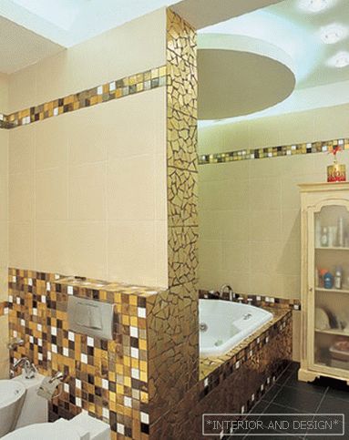
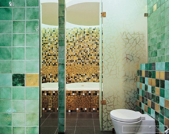
We tried to support this principle in everything. If they began to develop a classic theme, they immediately removed all the formal elements. Fully. No columns, no pilaster, nothing like that. Gold, for example, was used, rather, according to the laws of Art Deco: if gold is, then the whole wall is entirely ...
So if you mentally remove all the furniture and decor items from the interior, you will get a clear modern space. Volume, completely (good word, by the way) devoid of classic reminiscences.
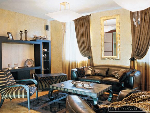
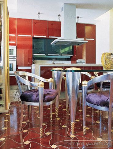
Non-classical, in fact, the layout itself: it’s not an enfilade, not a chain of closed rooms. This means that the boundaries between the fairly open spaces of the living room, hall, second living room, dining room, kitchen are solved by modern methods: the color and texture of the floor on the one hand, the color scheme of the rooms on the other. This is beige-brown-gold for one living room and lilac-maroon-wine for the second.
A ceiling lamp with a chandelier made of Murano glass is another indirect quote from the classics. Cited, however, in an absolutely alien context for past centuries. This form of chandelier is impossible to imagine in the "canonical" entourage. Twist, complex glass configuration. But the form itself is the most modern.
We thought for a long time how to choose a kitchen. We stopped at the radical version of the ultra-modern glossy kitchen from POGGENPOHL. Color matched to the color of the floor. A large reflective surface with a ceiling height dematerializes the very idea of the kitchen, creates a good "answer" to the dining room group. This is not a kitchen as a kitchen, but an architectural plane. "
Anna Karpova: "Colombo" is generally exceptional furniture. In the sense that it is difficult to choose the environment. To it can not pick up and furniture as well. Either you take one thing as an accent, or you take everything only from this factory. Of course, we could order a kitchen from them, they probably would have done it. But why? "Dematerializing" the kitchen, completely covering the wall with a glossy surface, seemed to us a much more successful move. "


