house in the suburbs


 Passing the gallery
 Text: Andrey Presnov
A photo: Olga Meleklesceva
Project author: Марк Товве, Elena Prokopieva
Magazine: N4 (148) 2010
The customer purchased a ready-made house in the village of Zhukovka. Among the reasons that influenced his choice was a successful layout, so the task of breaking and rebuilding the authors of the project was not. When developing an interior solution, they, at the request of the customer, tried to preserve the simplicity and clarity of the spaces as much as possible.
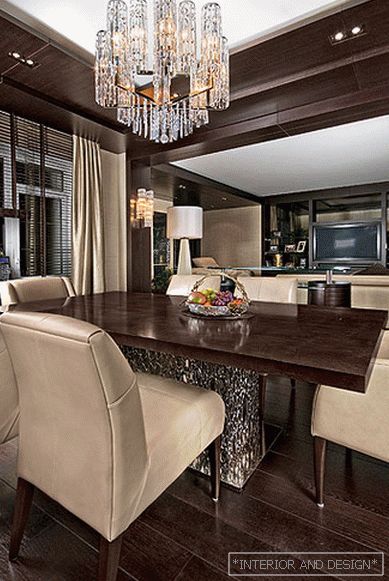
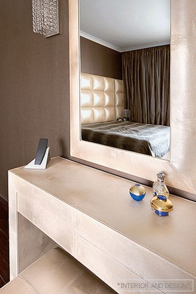
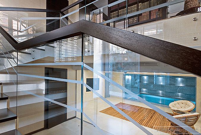
Initially, the internal structure of the building had some stiffness and severity. The architects tried to soften it with natural materials. They focused on natural stone, wood, plaster and mosaics. In addition, the decoration also performs the function of a logical bridge between different zones and levels of the house. This was made possible by the continuity of the color solutions involved in the design of each functional area.
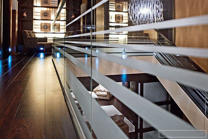
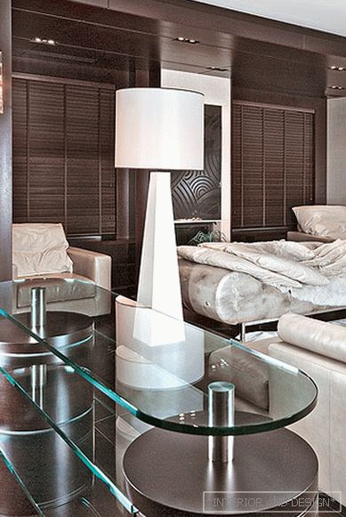
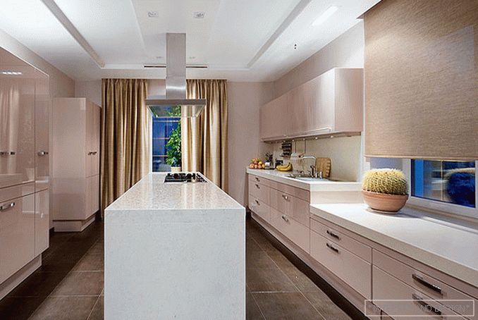
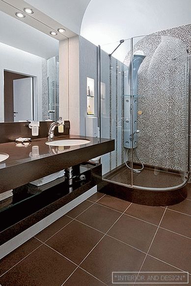
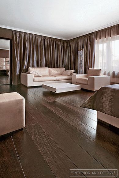
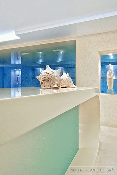
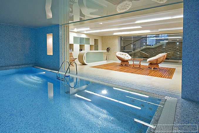
The authors created a feeling of a single, smoothly flowing space in the house. Furniture, made according to individual sketches, only supports this impression. It does not stand out strongly from the overall picture, but plays a key role in the formation of links between rooms. Stand under the TV, for example, here may be part of the library area, which, in turn, is adjacent to the office. The building has four levels. On the ground floor there is a cinema and a relaxation area with a pool and steam rooms. It is designed so that, despite the closeness and some limited space, here you feel like on the seashore. This effect was achieved by combining sand - cream color with bright blue in the decoration, which symbolize the sandy coast, as well as Mediterranean ultramarine. The front wall in the room with a swimming pool is turned into a waterfall, illuminated by lights built into it. There is a bar counter from Koriana.®as well as a seating area, marked by a teak board, which is built into the floor covering. On the ground floor of the races there is a hall, a living room, a study, a dining room and a kitchen. The latter stands out for its unusual, ashen - pink color. In the decoration of this level mainly used veneer veneer. Its dark color adds respectability to the interior. On the second floor there is a master bedroom, children's rooms, and also bathrooms. The third floor is an attic; there is a play area and a dance floor.
In general, the image of the house turned out to be somewhat strict, but this rigor was not raised to the absolute. The restrained color scheme of the interior is diluted with bright colored spots in the children's area and in the attic.
Corian® - зарегистрированный товарный знак Е.И.ДюПон де Немур энд Компани. Только Дюпон производит Corian®


