Amalia Talfeld on modern interior

 Passing the gallery
 A photo: Karen Manko, Oleg Parfenov, - © «Three A Design»
Interview prepared: Julia Sakharova
Magazine: Decor N7 (140) 2009
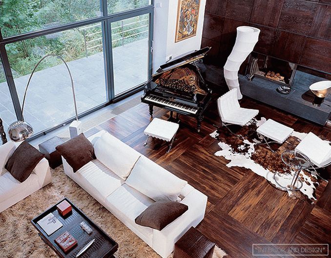
“I’m not afraid of open spaces; where you don’t want to make walls, I don’t make them (of course, if family lifestyle and habits allow it), a space that runs outside and breathes outside. Nature is a natural continuation of the interior.. So, actually, I did in my house (it was published in the magazine SALON-interior). The photograph taken from the mezzanine clearly shows the two-light living room space (its height is five and a half meters) and the entire glazed wall, and behind it is a forested area.
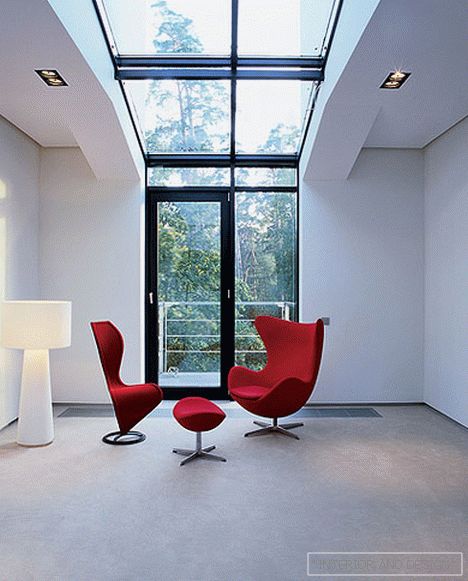
A well-thought-out scale game, a well-used method of contrasts, properly organized light, and also decorating work with textures and colors help make the space harmonious. There is such a law: if you have a large area in space, then it should be voluminous, that is, have sufficient height. When there is a volume, you can start working on the harmony of verticals and horizontals to create a certain structure in the interior. For example, in the living room, the famous floor lamp by design
But the reception of contrast is not limited to the opposition of verticals and horizontals, I usually use a pair of "light-dark", "soft-hard", because in a harmonious interior both visual and tactile sensations are important ... sofa, with its structural elements of chrome. I love natural materials, I often use natural leather, in particular, leather embossed under a crocodile.
Le Corbusier, Eileen Gray, Arne Jacobsen - these are not just big names in the world of architecture and design, they are also authors of furniture masterpieces; and I try to put such things in the interior. Years will pass - and they will not seem outdated, they will always look relevant. The interior, I think, must be done for a long time.
But if you want to change something, you can change accessories - pillows, flowers, vases ... In the winter, for example, pick up red objects, put a fox-skin veil. In the spring will look good lime color. Only we must remember that warm colors go well with warm, and cold - with cold. White, beige - neutral tones. You can learn a lot from nature, there is already "all shown": pebbles, thrown on the beach (cold shades), or trees on the background of snow (cold monochrome). The color of natural mats, the color of natural limestone, the color of bronze is an example of a combination of warm colors. cold gray shade "grezh". In Paris, a lot of houses, painted in this color. The main thing - do not overload. A good interior is always a little "unspoken" interior.


