Moscow apartment with an area of 208 m2

 Passing the gallery
 Text: Karina Chumakova
A photo: Sergi Shagulashvili
Project author: Maxim Rubtsov, Ангелина Аскери
Magazine: N1 (156) 2011
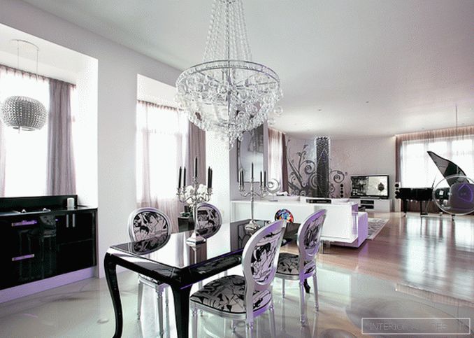
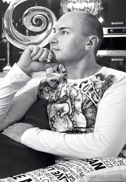
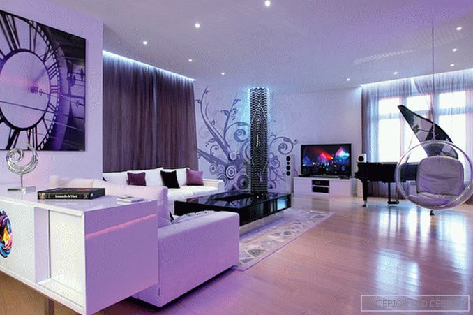
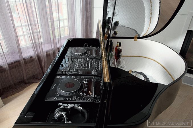
The unusual layout of the apartment is due both to the architecture of the building in which it is located, and the intention of the architects to create an extraordinary space, abandoning the canonical planning solutions. The apartment is located in a high-rise building in the center of Moscow. The large perimeter of the glazing is one of its distinguishing features. The architects did not split up the volume with partitions - this is how the common space of the kitchen-bar-dining-living room with a glass case and a supporting column in the front part was formed. This solution was very much liked by the customer - a modern young man who appreciates communication and often spends time with friends at home. One of its requirements for the layout of the apartment was the presence of a large space with conditional zoning, where guests could move freely, while remaining within the reach of audio and video systems.
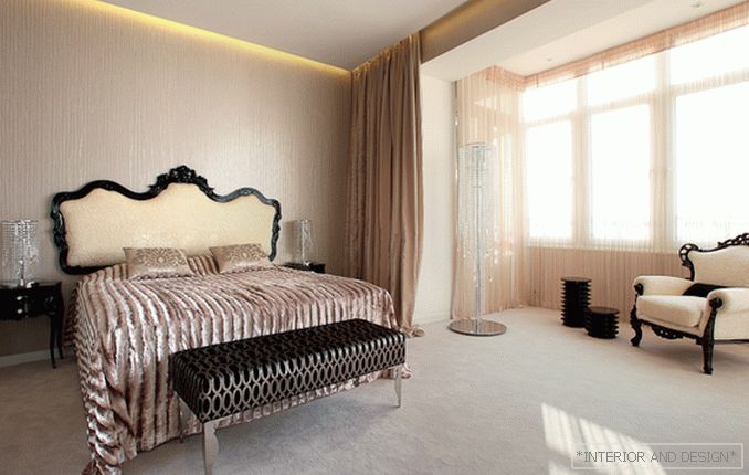
The authors define the style of the apartment as club minimalism with neo-baroque elements. This unusual mix of seemingly incompatible components translates best to the feeling of modernity and luxury of the interior; recently, the reception of such a stylistic blending has become one of the most sought-after when designing expensive European hotels and clubs.
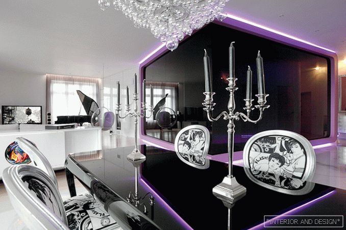
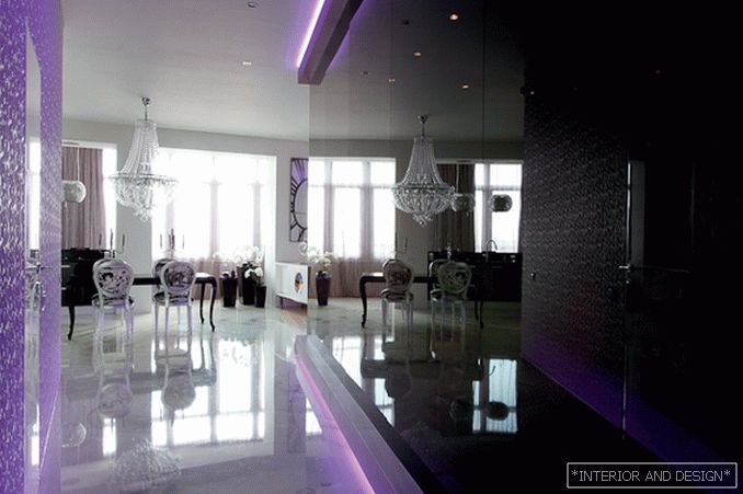
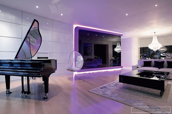
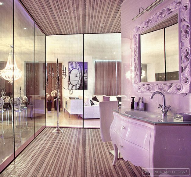
Using the terms of club life, the space of the apartment can be divided into “dance floor” - the living room area, “lounge” - kitchen-dining room, “bar”, “chill-out” - bedroom and “office” -work room. The bathroom became the architectural and compositional dominant of the apartment: its volume is inscribed in a cube that is visually “cut off” from the floor and ceiling. This effect is achieved due to the fact that the cube is solved in color that contrasts with the overall palette of the interior of the apartment, and is highlighted along the perimeter by a luminous neon strip. “This decision reflected our ideas about the current design; if you want, about the design of the future, ”says
The glossy surface of the cube (it is decorated with glass panels) echoes the shiny white panels of the front wall of the living room, which has a fireplace, and the ideally smooth surface of the self-leveling floor, decorated with a pattern of flying balls. The image of the ball passes through the entire interior of the apartment. So, in the living room attention is attracted by a ball-chair suspended from the ceiling; above the table in the living room we see a voluminous, but at the same time almost weightless chandelier of transparent glass bubbles; the column in the corner of the living room is rethought as a lamp woven from flickering balls ... The image of the ball enters into dialogue with the shape of a cube with rounded corners, "embedded" in the volume of a room of complex shape. Such a multi-level visual game works on the perception of the interior like no other avant-garde space.
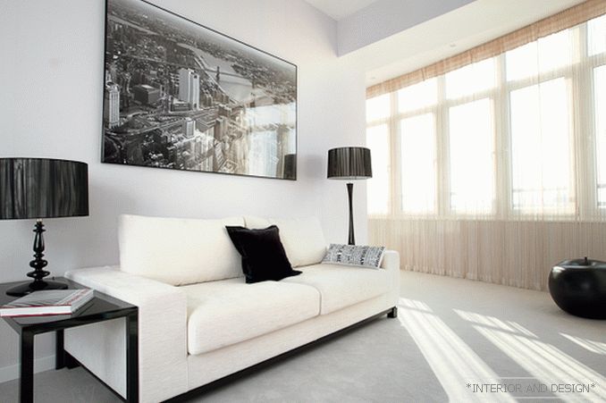
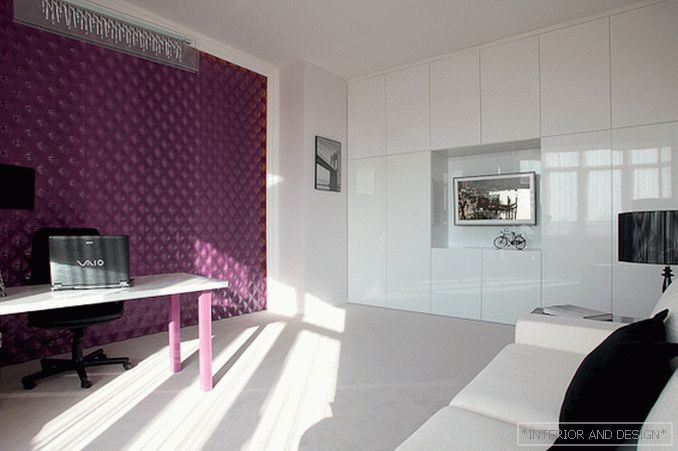
The interior of the apartment as a whole is sustained in neutral light colors with black accents and interspersions of reserved violet-purple tone. In the living room it is used in cube lighting, on bar stools, curtains and cushions, and in the office in this color a three-dimensional decorative panel is made.

