house with a total area of 600 m2

 Passing the gallery
 A photo: Nadezhda Serebryakova
Text: Marina Volkova
Stylist: Olga Roslova
Architect: Nina Zhorova
Equipment: Julia Kryuchkova
Construction Manager: Evgeny Likhov, Kirill Kryuchkov
Magazine: N4 (159) 2011
The customer wanted the interior to look expensive, but without redundancy.
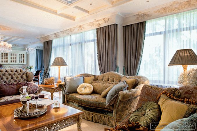
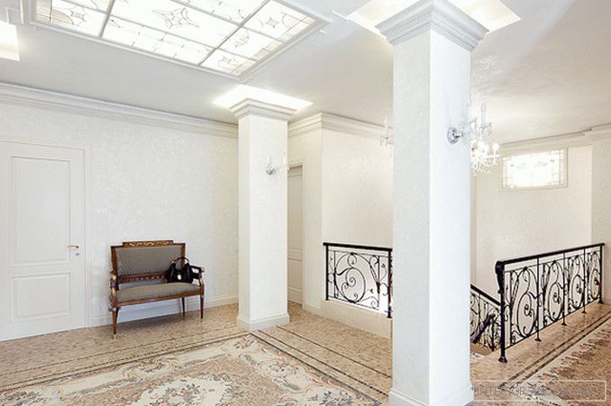
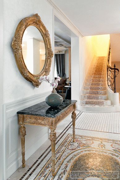
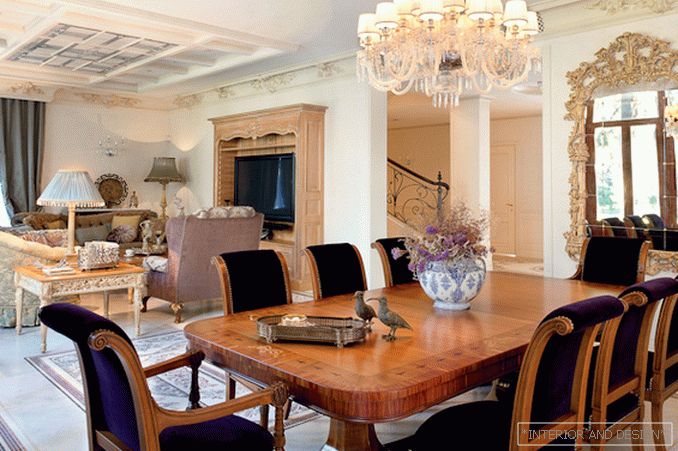
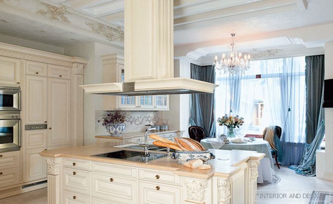
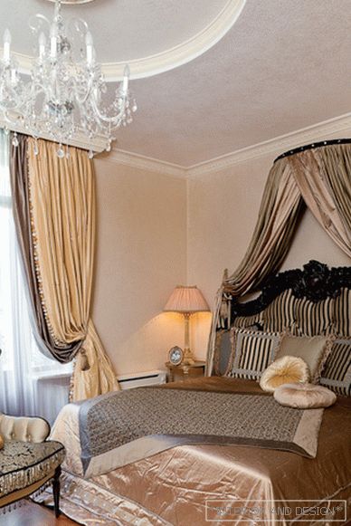
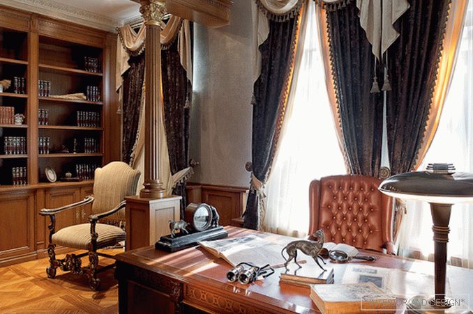
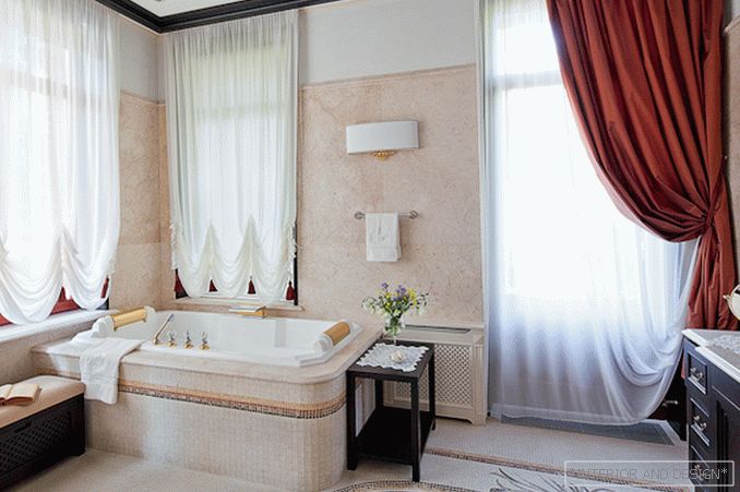
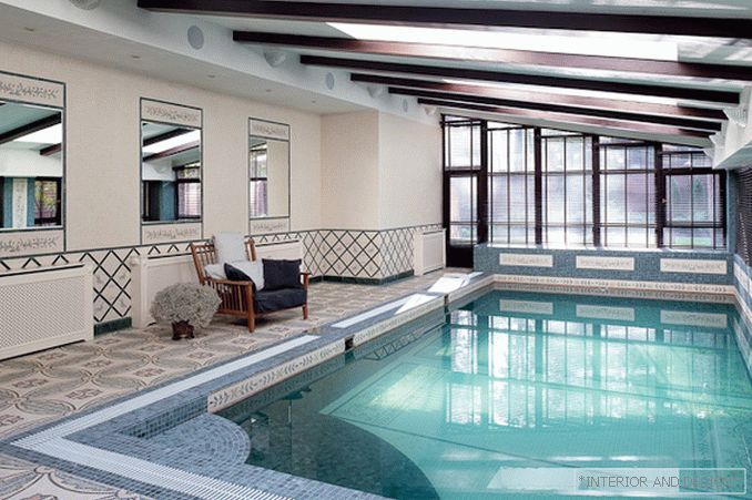
The house is two-storey, on the first floor there are concentrated public areas - a living room, a dining room, a kitchen, which are actually a single space, zoned only with the help of furniture arrangement. On the second floor are private rooms. “The customer wanted the walls in the whole house to be light, white,” says the decorator. - On the one hand, this is a winning solution: it is much easier to choose the situation for such a background. On the other hand, this creates certain restrictions in the color scheme: you can only play with the color of furniture, lamps and related accessories. Fully white turned out we have a lounge and kitchen. In other zones, we have added a bit of color from the calm, dim part of the spectrum. ” Each room is decided in its own color: in the living room (it also serves as a home cinema) pink-greenish colors dominate, in the dining room brown, the bedroom is pale peach. A massive ceiling cornice with a complex architectural ornament, ordered by the decorator in the Peterhof workshop, became the unifying element of the decor of the main area of the living-dining room-kitchen. In the design of this area set the tone for luxurious curtains. Under them were already selected furniture upholstery and small accessories. For example, the upholstery of the sofa in the living room echoes the soft turquoise color of the curtains, and for the lamp shades of table lamps the fabric is used to tone brighter than the curtains. “For a long time I was looking for colors that would be in harmony with each other,” says Julia. - After all, the interior is like an orchestra. Of course, there are solo, main instruments, but they should not interrupt the sound of the others. ”
Project author
Accessories for shooting provided by salons

