Moscow apartment with an area of 200 m2

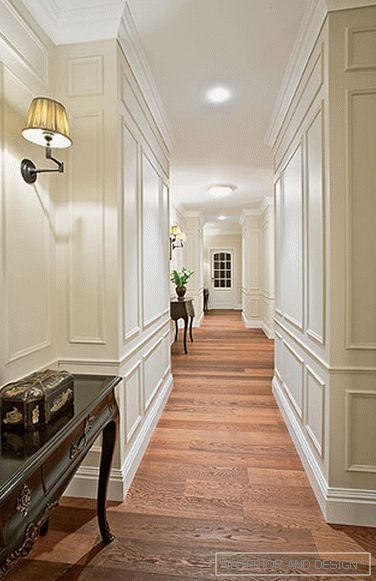
 Passing the gallery
 Text: Olga Vologdina
A photo: Gennadiy Semin
Project author: Marina Kisel
Design and construction: Andrei Murashov
Project Manager: Svetlana Degtereva
Magazine: N6 (150) 2010
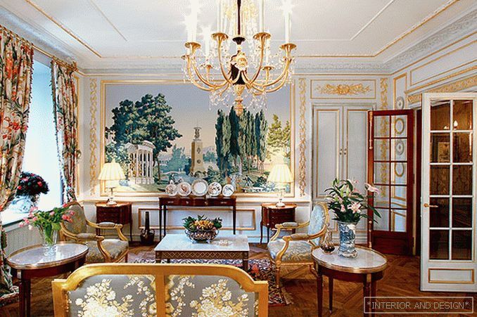
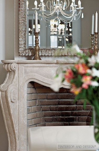
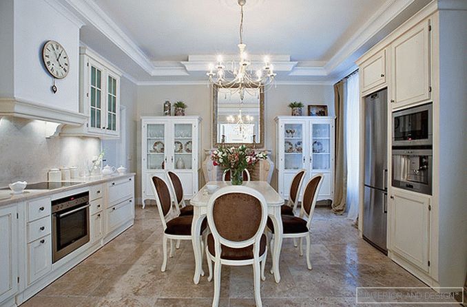
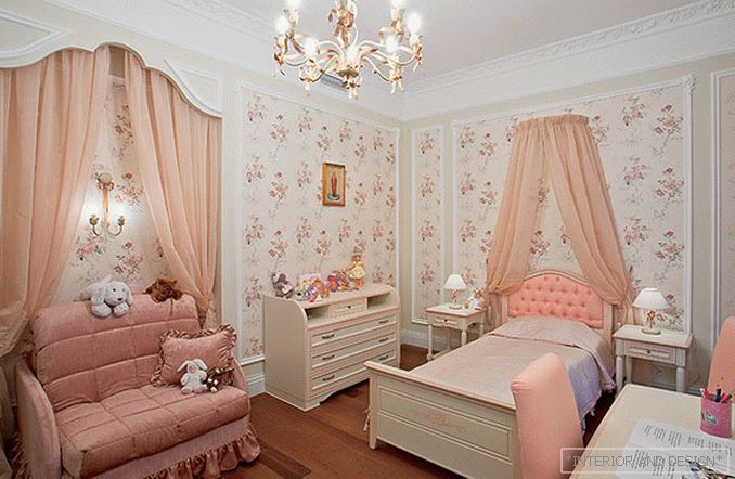
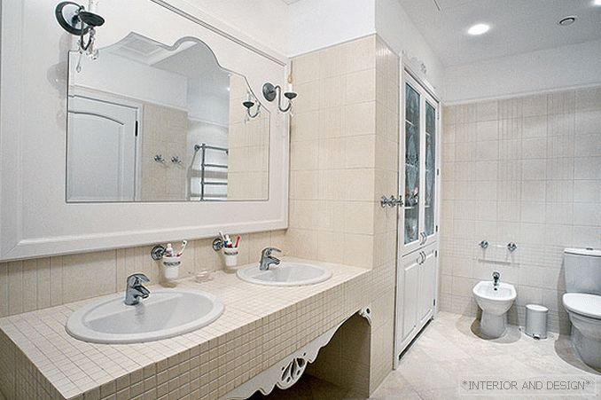
From the very beginning of the work, the customers (a couple with three children) clearly formulated their wishes regarding the appearance of the future apartment. They presented a sophisticated, lightweight French interior in a modern interpretation. Without excessive decor, artificiality, rather laconic in color and clear in layout. So, one of the clients' wishes was to use fabrics with a simple pattern, a little reminiscent of classic textiles with its complex, redundant pattern. The same technique touched finishing materials: the layout of stone and tiles in the kitchen and in the bathrooms is more characteristic of modern interiors.
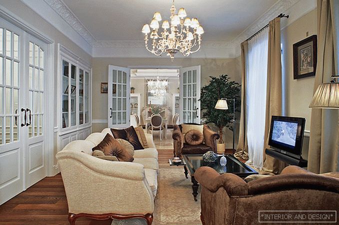
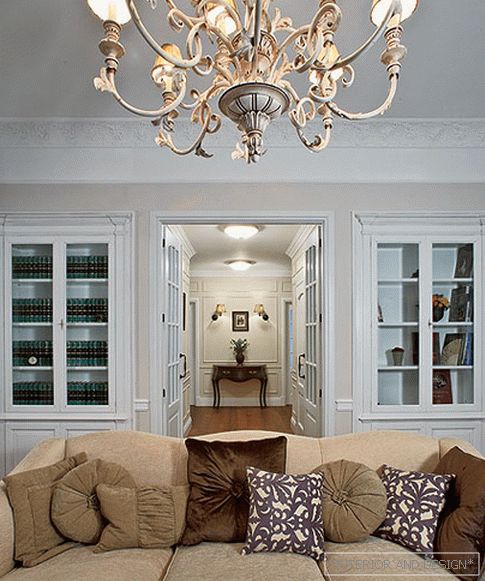
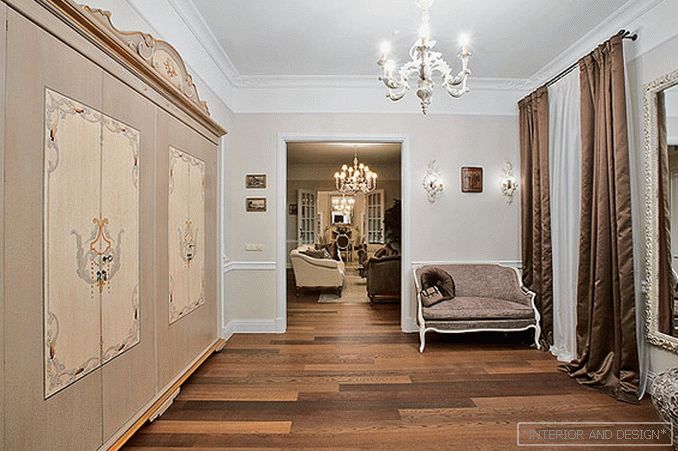
The main advantage of the layout is the enfilade, when several others are viewed from one space at once. Already from the hallway opens the prospect of the living room and, further, on the dining-kitchen. The second axis passes through a private zone: a long hall is organized like a gallery, through which the doors of the bedroom, children's and bathroom rooms go. At the request of the owners, the hall was to become an integral part of the ceremonial zone. Therefore, between the living room, the dining room, the corridor and the hall, the designer placed the swing doors with faceted glass. And even if the doors are closed, the rooms, however, are visible. The French mood in the interior creates a muted colors. Light and unobtrusive beige, beige-gray, marsh shades are emphasized with an oak plank tinted with a walnut on the floor. Light cream furniture and furniture of milk chocolate color, as well as black lacquered details pleasantly contrast with them. Classic-shaped lamps complete the image of “interior with history” - chandeliers, wall lamps, floor lamps that give a soft, pleasant light.

