How to make the monochrome interior not boring? And how to ensure that multicolor does not tire? Anastasia Rykova reflects on the art of color balance.
 Passing the gallery
 Magazine: Decor N10 (198) 2014
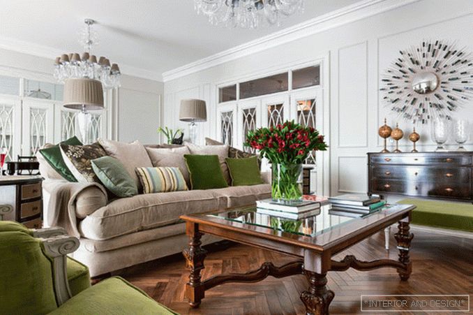
Anastasia Rykova: “In a private interior, you need to remember the law: it is better to under-paint than overdo it. However, there is a danger of falling into one of the extremes and getting either a walk-through beige interior, or an interior with flashy color accents. How to avoid it? First: in a monochrome interior, use a variety of textures. For example, in the interior of this living room, made in collaboration with Anastasia Bozhinsky and Anna Denisova, a neutral color palette is used as the base, but it nevertheless does not look colorless. Strengthen the impression and be boring this interior helps that the upholstery and curtains are fabrics of various textures (as well as fabrics with prints). This is both silk and velvet (cotton and silk), and wool, and embroidery ... Second: let the interior have a striking decorative detail in the interior, then you certainly cannot call it ascetic. Here, for example, individually designed bindings of doors with vertical transoms; crystal chandeliers; carved inlaid furniture and carefully selected little things like door handles. This is a truly cozy family lounge. The key word for this interior is “balance”: a balance of color, a balance of contrasts, a balance of decor in an interior. Molded cornice, but without gilding; a crystal chandelier, but without a heavy frame and stained glass; furniture inlaid and threaded, but very restrained in shape.
Read the full text in paper or


