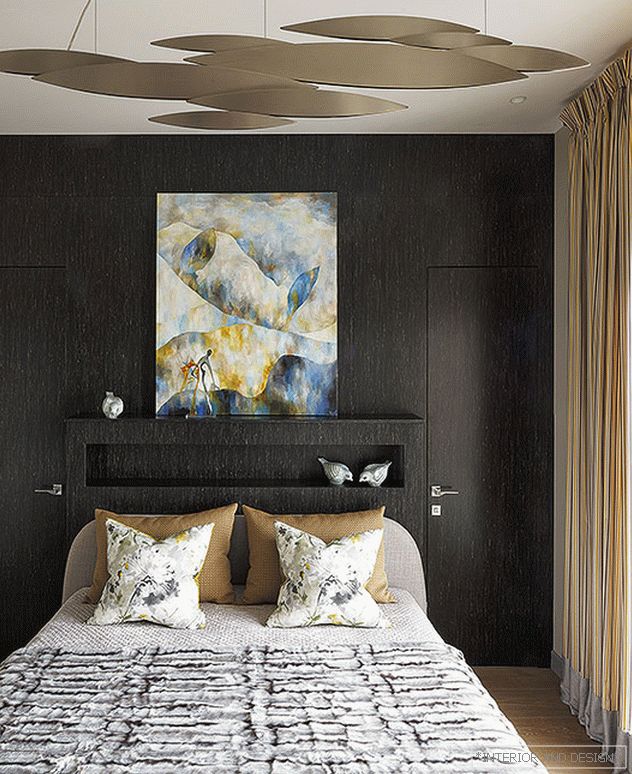
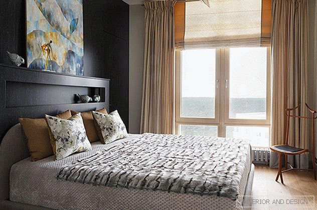
 Bedroom. On the wall is the work of R. Semenov “Metaphysical Landscape”, Art Burt Gallery. Bed Twils. Chandelier Terzani. Panels, doors - the company Leto.
 “The picture at the head is directly related to the view outside the window, color and light in the interior - this is the very emotional spot without which the“ picture ”would not have happened,” says the designer.
“Not a single interior will work without properly selected art. It can be expensive, very expensive or not very important - the emotional component that creates the mood of the interior and forms its character is more important. Sometimes art sets the rhythm and concept, but in this case, on the contrary, I selected art for the situation.
Related: Art Experience: project by Olga Potashova and George Okorokov
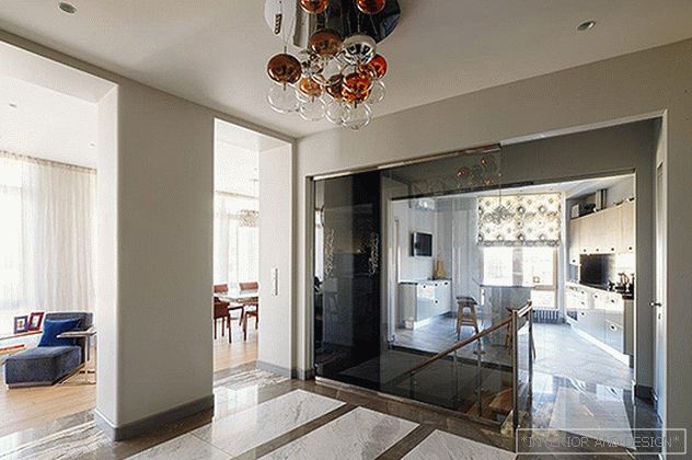
In the project there was a task to combine two apartments of different layouts, located one under another on different floors. The upper one was intended for parents, the lower one - for children (girls of 12 years old and 17-year-old young man). The attention was attracted by a zone with glazing on three sides, from where a bird's-eye view opens up to the sky, clouds and the tops of pines and firs. The feeling of air, soaring, nature ... This room became the main one, it created a living-dining room, which adjoins the hall and kitchen. Customers do not like bright open colors (asked to use them locally), prefer natural shades and shapes.
“Customers love quality and comfortable things. A well-known fact: a quality thing is beautiful in its simplicity. "
 Project author Madina Vykhodtseva. “Any art always looks perfect on white and gray walls. The more active the picture, the more neutral the background, the designer believes. - Furniture was selected primarily on the principle of "comfortable and functional."
 By art are at the level of sensations: "like - do not like," "my - not mine." Tasks to find something specific or unique did not stand. In the selection of art and drawing up the interior as a whole, I pushed away from the panorama outside the window. All the colors from the outside are present in the colors of textiles, finishing materials, as well as in the palette of paintings. The works of young but talented authors complemented the interior well. I like when one flows into another, when the texture of the fabric echoes the stone, the pattern on the ceramics repeats the texture of the wood, etc. This is an endless game that makes the interior complex and solid.
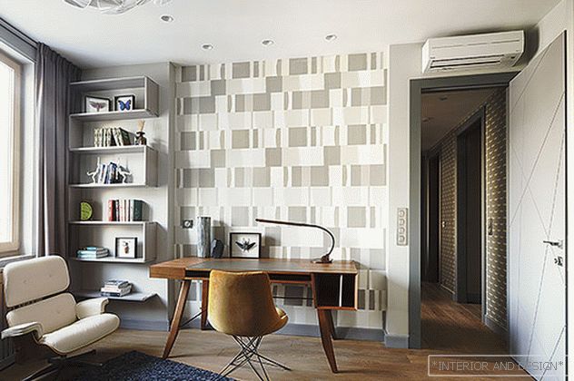 Desk and chair Arketipo. White chair Flexform. Latitude rack. Wallpaper Harlequin (salons Manders). Chandelier Luceplan.
 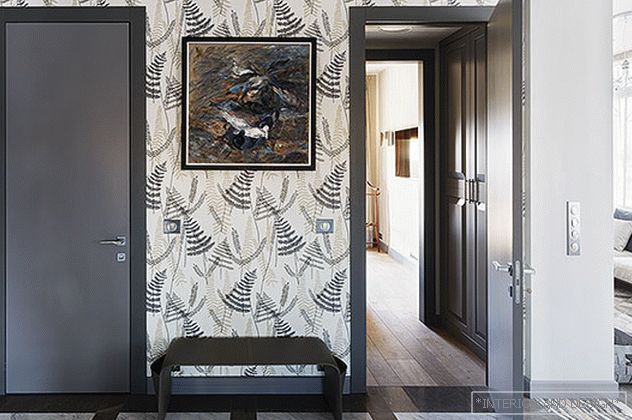 In the wall, the work of S. Aubakirova.
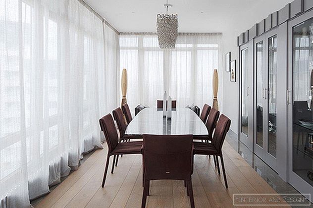
 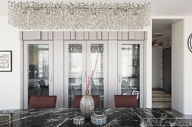 The table top of the German factory Draenert is made of solid marble slab. Chandelier Brand van Egmond. Left on the wall are two works by I. Koroleva. Watch Nomon. Built-in showcases according to the sketches of the author of the project.
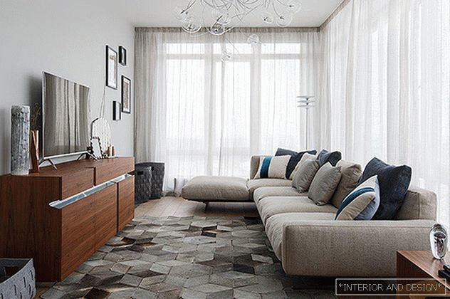
It is very important how the work is framed, I always do it personally. Design directly affects the perception. It gives a picture or photos a finished look, helps to fit them into the interior, enhances the impression. The frame is a link between the interior and the picture. It can set off an image, but not over-attract attention - the picture plays a dominant role. Works can be bought at auctions, exhibitions, in art galleries. But, if there is an opportunity to meet and talk with the author in person, be sure to do it. Then art acquires special value! ”
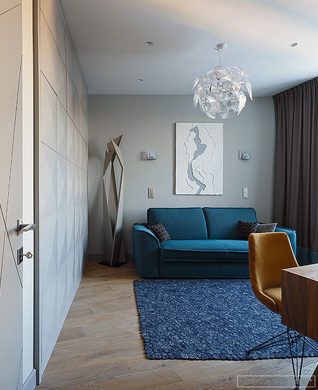
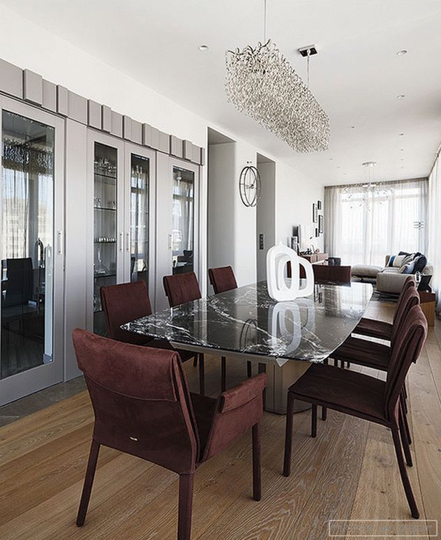 The living-dining room with glazing on three sides became the main area. Around the table Draenert chairs Сattelan Italia. Deep in the sofa flexform.
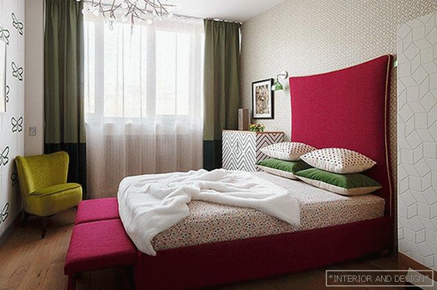
 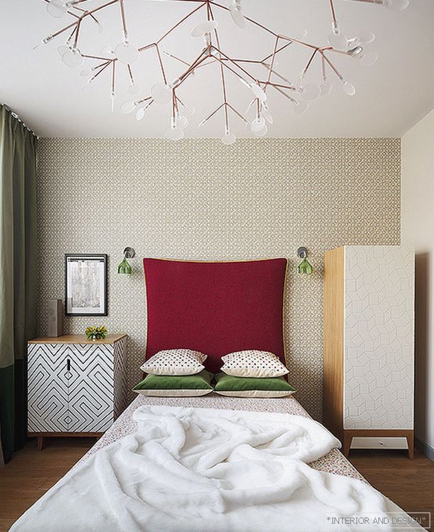 Loffilab bed. On the wall is the work of I. Koroleva. Sconces Kartel. BraginDesign cabinet. Moooi chandelier.
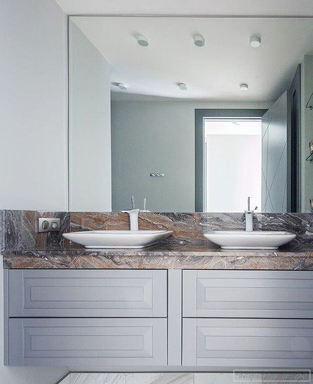
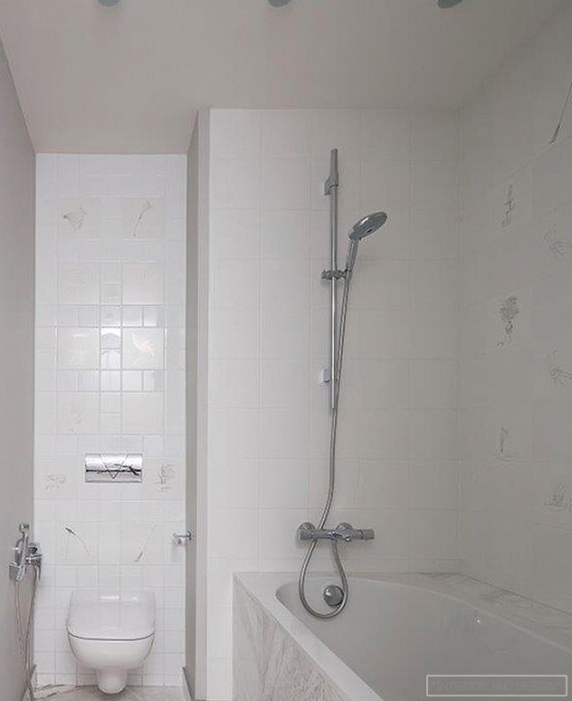
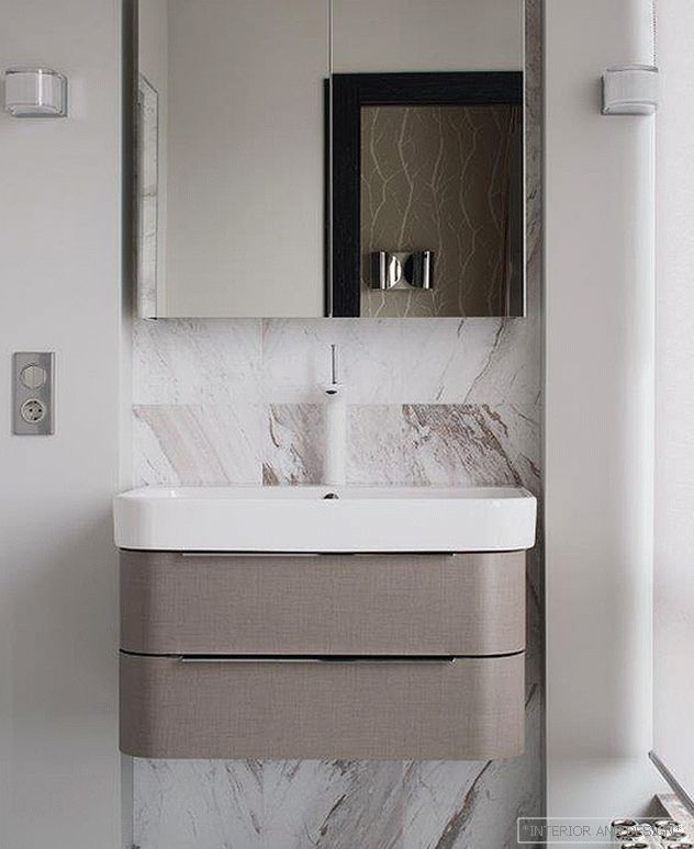
 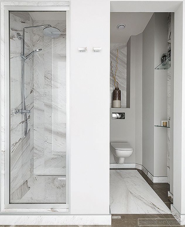 Bathroom marble varieties volakas and martha grey.
 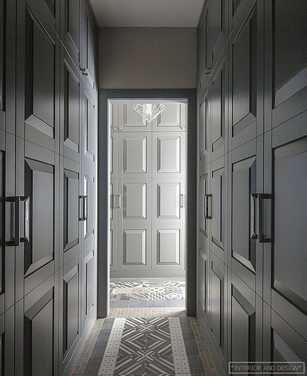 Joinery made by the sketches of the author of the project.