two originally similar in layout apartment. The total area of each - 82 m2 Edward Hovsepyan, Sonya Yaltseva
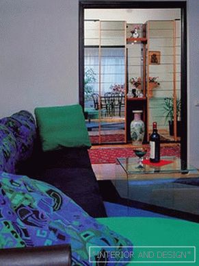
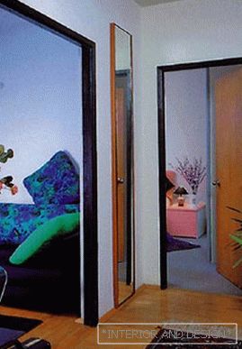
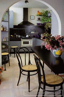

 Passing the gallery
 A photo: Zinon Rasudinov
Text: Anna Gedymin
Architect: Edward Hovsepyan, Sonya Yaltseva
Magazine: (4) 1995
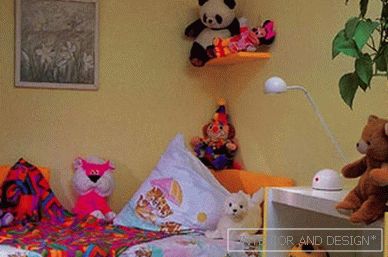
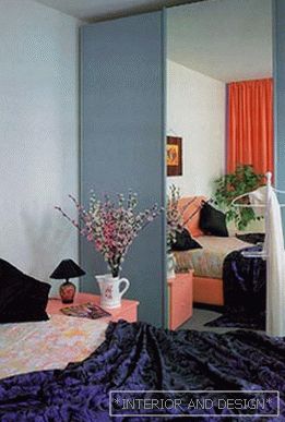
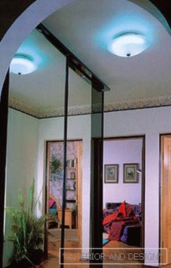
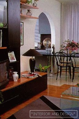
The young hostess who met us said that at first she had only a request from the architects: to increase the facilities of the bathrooms and add a toilet to the bathroom, and a toilet in the toilet. "People we are independent, working, we sometimes have no time to wait at the locked door, and this is inconvenient." The request of the owners was satisfied, which was made possible thanks to the initially wide corridor leading to the kitchen. The corridor, however, and now does not look cramped, and even more so - dark. The walls in the entire apartment, with the exception of the nursery, are white; the floor in the corridor and the kitchen-dining room is lined with white tiles, And the corridor ends with an arch, creating a feeling of aspiration upward, lightness, harmony. The doorway connecting the living room and hallway, the owners decided to leave the rectangular. Thought over time to crash the door here or something like that. Now, three years later, it became clear that they were wrong: as the professionals had predicted, no doors were needed here. Moreover, mirror cabinets located in the hallway should, according to the authors' idea, “shine through” the room through - only then there is a feeling of overcoming the limited space, increasing the area. Passing through the arch, you find the second - and the last significant change made by the architects to the layout. The less than ten-meter kitchenette is united, through another, already wide arch, from the living room. As a result, it became possible to equip a kitchen-dining room, expanding the space at the expense of the adjacent room. A full-length ebony dining table stretched gracefully through a white arched opening. The visible border of the floor and living room is marked not only with furniture (in the living room - soft, greenish tones), but also with floor covering (white tile in the kitchen-dining room, carpet in the living room).It is absolutely necessary to note: the arch in the supporting wall of the house was made possible only because the apartment was on the last floor (even in this case additional reinforcement was required). Here you have the "first and last not to offer." However, this maxim has become outdated for several years now: the first floors are transformed into prestigious offices and shops, the latter attract the attention of wealthy people with wide possibilities of interior reorganization. Bedroom and nursery - the rooms are very different. In the bedroom, softened light blinds, calm colors create the necessary atmosphere for rest. On the contrary, in a symmetrically arranged children's wall, painted in joyful yellow tones, they are combined with a light wood headset. Grace, thoughtfulness, impeccable taste - this is how you can summarize the impressions left by this apartment. All furniture and equipment was brought from Italy - the trendsetter in the field of interior design. Only parquet domestic, Russian: here we are not inferior to the West. There are few things, in fact, but they are all extremely functional and - in their places. And here’s the result: a small three-room apartment not only accommodated a family of four, but also unexpectedly discovered free spaces, gave its inhabitants the opportunity to stay comfortably. On the day of my arrival there was the usual June heat in Moscow on the street. And in the apartment, despite the lack of air conditioning, it was not hot. Maybe because of the abundance of tiled surfaces? "I wonder how is life here in the winter?" - already in the front flashed a farewell thought.
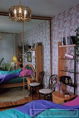
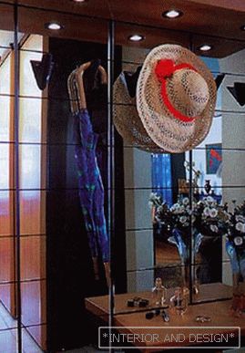
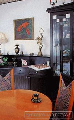
Another apartment greeted the guests with a snooty dog barking: the owners had just taken a second rottweiler. Hardly crossed the threshold, you understand: they live here not too orderly, but somehow very comfortable. When working on a project, the architects had to solve two problems at once: on the one hand, to provide living space for all inhabitants, and on the other, to avoid the lack of soft surfaces, secluded corners, and peculiar asceticism. In addition, it was necessary to reckon with the needs and habits of the owners. For example, the presence of animals in the house forced to abandon the carpet. It was not easy to convince the hostess of the advantage of a contrasting color palette; objected to the alleged white color of the walls. As a result, there was a compromise solution: picking up the wallpaper in a two-color strip and cutting them along, the foam in the living room and room finished their daughters and grandmothers with elegant, unobtrusively overlapping borders. But all this - the background. And what about the present? The floor in the apartment is parquet, oak, domestic. Only here and there mats are scribbled: where for dogs, where just for comfort. To the right of the front door is the corridor to the kitchen. He, like in the first apartment, is watered down, but not due to the expansion of the sanitary facilities, but because his left side is entirely occupied by a large wardrobe. On the right hand there is a door to the bathroom and a toilet. The walls are lined with black tiles, slightly animated by a subtle, whimsical pattern. It looks very beautiful, but ... - All my life I dreamed of a black tile, and now I had a lot of trouble with it, - the hostess complains. - After all, every drop is visible, you have to wipe it every now and then. Perhaps this is the only inconvenience that was found in two years, Not so much, right? Returning down the corridor and past another arch, you find yourself in a vast living room. It is formed by merging the former large room with a hallway. The Yugoslav upholstered furniture and the German ebony suite were freely accommodated here. Mirror doors of the cabinet, located in the end, opposite the windows, visually expand the space. The bedroom is the only room in the apartment that is covered with wallpaper. Dim, under printed silk, they both surprise with luxury - and relax, relieve tension. But the symmetrical bedroom of the room of the daughter and grandmother looks different - there the atmosphere is rather businesslike, cabinet. This is logical: the daughter-student is engaged here, and the grandmother only spends the night, spending the rest of the time in the living room or in the kitchen, at the small TV. - To retool? No, we are quite happy with everything here, - the owners of the middle generation answered my question. This is their first "real" house, where they did everything they wanted. Until now, there were temporary shelters, apartments with inherited furniture. And now - everything. Here they intend to settle for a long time, God will give - forever.
The more common features a careful look finds in these interiors, the more obvious are the differences: in the home environment, in the life and cultural attitudes of the owners, in the ways of self-realization of the individual. The two originally related interiors lead a silent conversation. Conciseness of light and light walls, without any transition interlocking with the ceiling - and the patterned frieze. Comfortable, high-quality and light Italian furniture, the brainchild of modern industrial design, ready tomorrow to give way to a new fashion without much talk - and a much more conservative German set, solid, acquired for decades. The latest high-quality finish, smooth, ideal for practical needs of the surface - and a serious choice of material, attention to its design and texture, to its true or apparent value. This series of oppositions could be continued and noticed, for example, that a slightly careless, a little mocking, if I may say so, “youth” style is polemical in relation to the careful and painstaking gathering of antiquarian things. Contrasts are striking when visiting two apartments. But are they random, or do they reflect some deep, essential differences? Let's open the door to the bedroom. Intimate chambers differ as much as n


