apartment of 380 m2

 Passing the gallery
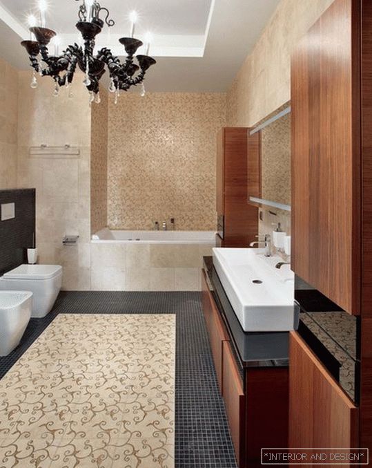
 A photo: Dmitry Livshits
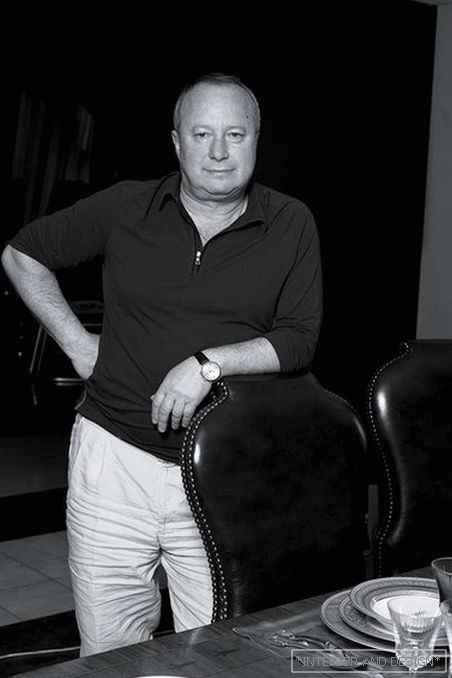
Text: Marina Volkova
Main architector: Yevgeny Borisov
Design: Oleg Tychin
Magazine: N11 (177) 2012
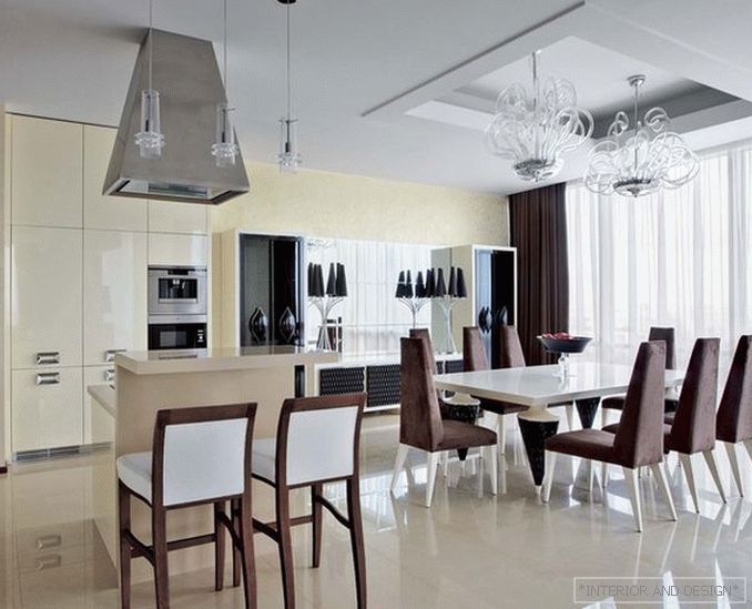
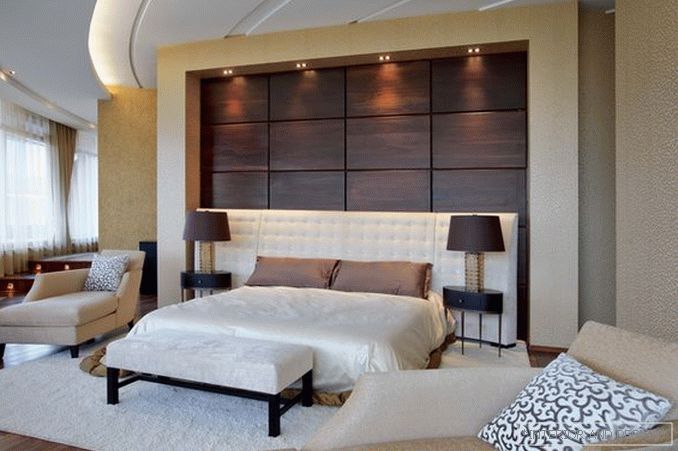
The author of the project, architect Yevgeny Borisov, says: “This is a two-story apartment in a luxury residential complex, intended for couples with children. The premises are clearly distributed. On the ground floor there is a living room, a dining room, a kitchen, and children’s. On the second - the private room of the owner and hostess. The original layout suggested such a separation. It suited customers, and we did not change anything. ”
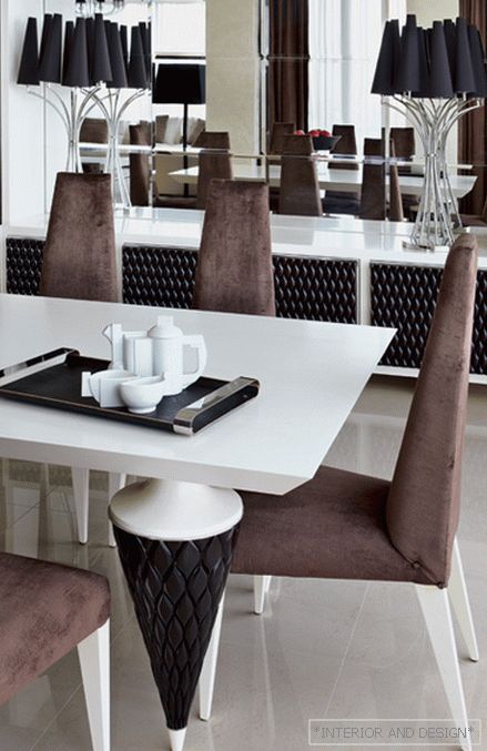
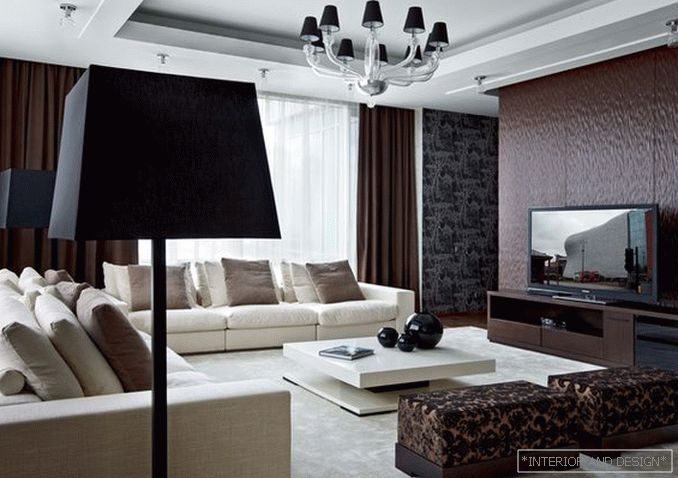
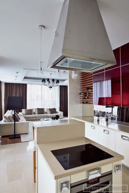
Penthouse decorated in the same style. Eugene calls it a modern classic with ar-deco elements, which was manifested primarily in the choice of furniture. These are the collections of the TURA factory, which are aggravated by Art Deco: clear, geometric shapes, expensive finishes. In particular, the so-called parchment skin is used. It is treated in a special way so that it becomes as thin as possible.
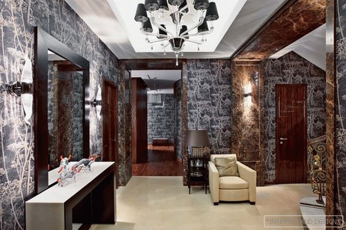
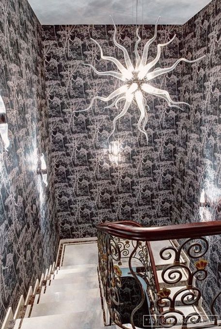
In the decoration of the apartment as a whole, rare, valuable materials are used. Special attention was paid to the hall. “This is the first room in which you find yourself, getting into the apartment, - says Eugene. - And he attaches special importance. It's like in the story: the beginning must be fascinating, so that you want to read further. ” The walls are covered with spectacular English wallpaper with floral patterns - it creates the feeling that you are in a fairytale forest. Interesting design of the entrance portals. They are finished with slabs of Emperador Dark marble.
“It is this element that sets the right tone,” comments the architect. - This type of marble has a very beautiful color - cherry-brown with light divorces. And it looks expensive, elegant. " Different shades of brown — such a range was the wish of the customers. The authors of the project chose coffee as the main background and added lighter (sandy) and darker ones (the colors of dark chocolate). White and ivory color complete the look. “The color decision is in favor of the unconditional taste of the owners,” says Eugene. “And at the same time it is cozy, good here.”


