The interior of this apartment, for all its elegance, looks artistically at ease, and this is a special merit of its authors.
 Passing the gallery
 A photo: Dmitry Livshits
Text: Julia Sakharova
Project author: Anton Fruktov, Marina Fruktova
Magazine: Decor N5 (204) 2015
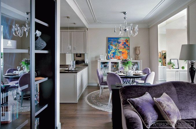
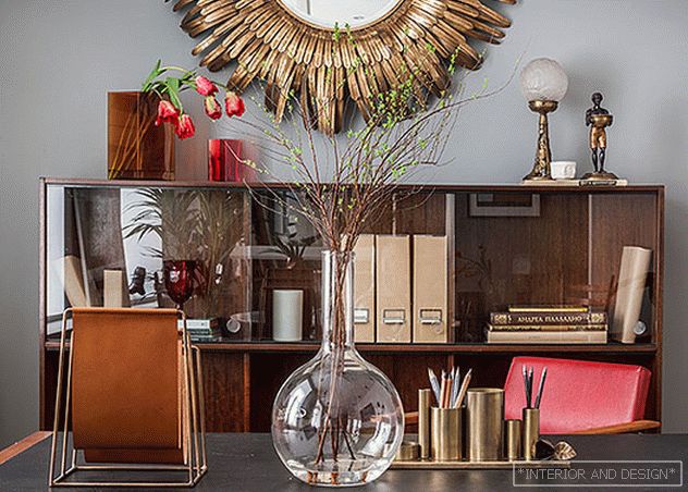
The apartment was created for spouses who have already raised children and planned to live here together. This circumstance influenced both the layout and the style of the interior. In the planning, the authors, in accordance with the individual requests of the owners, allowed themselves some non-standard solutions. Thus, the entrance to the front area of the apartment, decided as the open space of the living room – kitchen – dining room, is through the kitchen area. The door from the living room leads to the bedroom. The bathroom from the bedroom can be accessed through the dressing room. There are no corridors in this apartment at all. Thus, not too much space (about 100 square meters) is used to the maximum, and I must say, the apartment seems more than it actually is. This effect enhances the abundance of mirrors. However, this technique is used indirectly and subtly. The mirror wall is only in one room — in the hall. And in the loggia, for example, the mirrors are decorated with slopes, which immediately breaks the usual perspective and expands the space. The apartment has a bay window. It seems more due to the two high mirrors that imitate its side sections. And in the kitchen made a mirror "apron". “In the hall, we used a classic technique — a mirror on the mirror: a Venetian mirror was mounted on a wall of dial mirrors,” says Marina Fruktova. .
By the living and fashionable modern classics with elements of ar-deco, as described by the interior style of its authors, did not come immediately. The owners were impressed by the classics, and this became the starting point. “Pure classics is not at all what the apartment owners really wanted. Fortunately, it soon became clear, Anton Fruktov recalls. They liked the classics that we look at from today. In addition, they had a collection of modern painting, but for it it was necessary to create a decent "frame". By the way, the owners then bought the paintings, and they brought a fresh note to this interior. ” As a result, modern painting, neoclassical showcase, table and chairs, which are close to Art Deco, coexist in one space. The lavender velvet sofa is modern, but with a “genetic memory” about the classics.
About the palette of this interior authors tell with enthusiasm. “The main shade is a complex beige-gray,” says Marina. “It is perceived by the eyes as cold beige or warm gray and perfectly combines with the shades of lavender that the hostess likes so much. And in the bedroom, knowing that there would be a red-colored cover, we added a bit of green to it: in this form, it is good in combination with red. ” But are particulars important when there is a main thing? The owners managed to breathe real, genuine life into this interior.
Read the full text in paper or


