Moscow apartment with a total area of 221 m2 Maxim Orlovsky
Passing the gallery
A photo: Zinon Rasudinov
Text: Vasily Lifanov
Architect: Maxim Orlovsky
Magazine: N5 (28) 1999
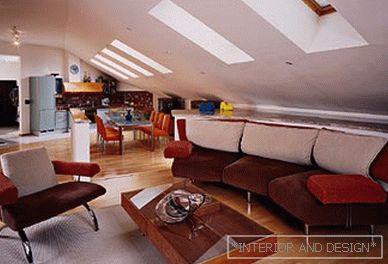
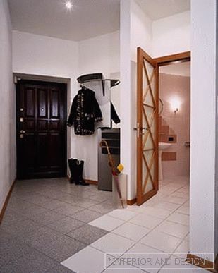
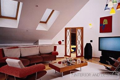
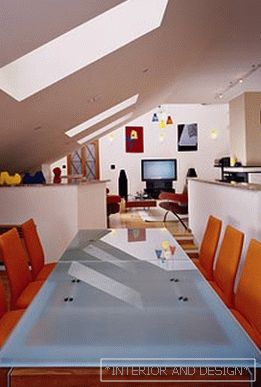
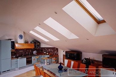
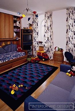
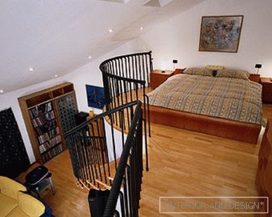
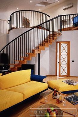
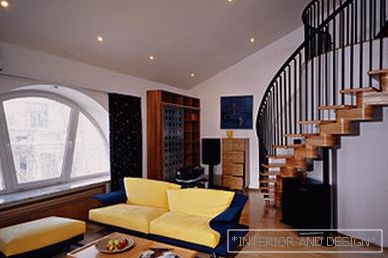
This story itself is not unique, although, of course, there are not so many houses with a similar biography. So, there was an old building. During its restoration, the attic floor was “cut” by architects into abstract apartments - based on the requirements of a large customer. The apartment was divided into a "public" and "private" part - there were parents' bedroom with a separate bathroom, and a nursery, and a kitchen-dining-living room. And the spacious bedroom and the nursery are “furnished” with a beautiful view of the city from the semicircular windows. The quotation came out from the united "public" zone of the kitchen-dining-living room. This space was originally reminiscent of a pencil case, a car, and a ship corridor, giving rise to a not very comfortable feeling of punishment and “transit”. Not home comfort, but - "always passing through." How did it happen? It is simple: the room is strongly extended in length - this is in the first place, and secondly - it has a roof slope with a number of inclined loopholes-portholes as the ceiling. Needless to say, all these problems were successfully resolved? Of course, worth it (in the next chapters). As for the style that was asking for it, it turned out to be very close to the minimalism that is currently relevant - strict, calm, proud of, above all, its light-air effects.The public part of the apartment: three rounds of struggle with the "corridor" Immediately after the entrance door, we enter a small hallway. It would be possible to call this room “corridor”, if its “natural” length did not destroy the oblique enclosure under the guest bathroom. By passing in his white palaces, you note with satisfaction the presence of triangular tiled “figures” of cream color. They safely "rhyme" with the wrong outlines of the room itself. But we go further. We go on the tiled floor of gray shades, which diagonally leads us to the public part of the apartment, namely to the kitchen and dining room. Kitchen furniture is built along an oblique wall. The dining area ends with steps that lead to the living room. The living area is marked with raised floor, which makes the proportions of the room more comfortable. Even more expands the space is the same technique with the transverse laying of the floorboard. The rigidity of the ceiling plastic and its related squareness of the fireplace was softened in detail from two sides. On one side there is a semicircle of the back wall with paintings and a TV, as well as a “lined” bedroom door and a multicolored bunch of chandeliers hanging from the top of the light well. By the way, this tall mine was also formed due to the difficult-mansard location of the apartment. Designers tried to saturate the space with light as much as possible, having made two windows at the top. On the other hand, the visual rigidity is overcome by the shape of the sofa, built along a semicircular wall, which “inhabits” the low space under the roof slope. On this wall are placed all sorts of funny gizmos, and inside it there are tanks for keeping things more active. The entrance is from the dining room.Master bedroom: three in one There really are three spaces in one. They are located on two levels. And because the room is painfully high, it was a sin not to use it. Above - an open sleeping compartment with a low bed, bedside tables, a TV, a wavy mirror and a wavy chest of drawers. Below - the master's bathroom and recreation area. The main source of daylight in the bedroom is a vast semicircular super-window, which offers a beautiful view of old Moscow. In search of spatial “rhyme” for this window, we again look around the room - and here it is consonance: the semicircular wall of the master’s bathroom, behind which a hot tub is guessed. The bend of the wall underlines the run-up lines of the stair railing.Children's room: the interior of the items Indeed, here is a clear example of how the interior is "mounted" with the help of furnishings. For the space here is so architecturally neutral that it seems that it does not exist at all. And there is a spacious room in which sofas, wardrobes, a chandelier, a carpet, toys, a picture on the wall, curtains on the windows feel freely. And, of course, children. Which, of course, does not care about the stories in which their cozy spacious House was born.
 Passing the gallery

